ISEE Lower Level Quantitative : How to use a Venn Diagram
Study concepts, example questions & explanations for ISEE Lower Level Quantitative


All ISEE Lower Level Quantitative Resources
Example Questions
Example Question #11 : Venn Diagrams
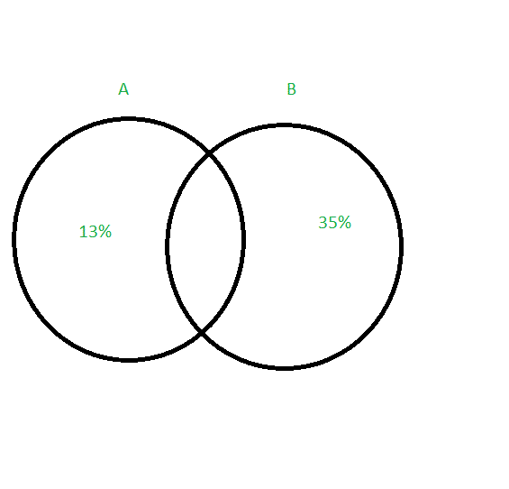
The Venn diagram above represents the results from a recent survey given to middle school students. Category 

What percentage of students only like pizza?
Possible Answers:


Correct answer:
Explanation:
Since Category 

Our answer is 


All ISEE Lower Level Quantitative Resources
Popular Subjects
GMAT Tutors in Dallas Fort Worth, SSAT Tutors in Dallas Fort Worth, French Tutors in Atlanta, Algebra Tutors in San Diego, GMAT Tutors in Denver, Calculus Tutors in Atlanta, Math Tutors in Atlanta, MCAT Tutors in San Diego, Algebra Tutors in Denver, Algebra Tutors in Chicago
Popular Courses & Classes
SSAT Courses & Classes in Washington DC, GRE Courses & Classes in Houston, MCAT Courses & Classes in Philadelphia, ISEE Courses & Classes in Boston, GRE Courses & Classes in Phoenix, SSAT Courses & Classes in San Diego, MCAT Courses & Classes in Seattle, SSAT Courses & Classes in Denver, Spanish Courses & Classes in Houston, GMAT Courses & Classes in Houston
Popular Test Prep
SAT Test Prep in Miami, SAT Test Prep in Dallas Fort Worth, GRE Test Prep in New York City, LSAT Test Prep in Los Angeles, LSAT Test Prep in Atlanta, GRE Test Prep in Phoenix, SAT Test Prep in Phoenix, SAT Test Prep in Philadelphia, MCAT Test Prep in New York City, SSAT Test Prep in Houston

