ISEE Lower Level Quantitative : Venn Diagrams
Study concepts, example questions & explanations for ISEE Lower Level Quantitative


All ISEE Lower Level Quantitative Resources
Example Questions
Example Question #1 : How To Find The Common Part With A Venn Diagram
Students were asked if they prefer TV or radio. The following Venn Diagram depicts the number of students who said TV, radio, or both. How many students like both TV and radio?
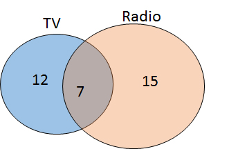
7
15
12
22
7
The blue circle of the Venn diagram depicts the number of students who prefer TV, the orange circle depicts the number of students who prefer radio, and the region of overlap indicates the number of students who like both. Therefore, 7 students like both TV and radio.
Example Question #1 : How To Find The Common Part With A Venn Diagram

Aracely posted a survey question using one of her social network accounts. She grouped the results into three categories. The response results are represented by the Venn diagram shown above.
Group 

What percentage of the respondents answered "maybe" to Aracely's survey question?


The overlapping portion of the Venn diagram represents the percentage of respondents that answered "maybe" to Aracely's survey question.
Since the diagram shows that exactly 

The solution is the total percent population take away the percent that answered "yes" or "no":

Example Question #3 : How To Find The Common Part With A Venn Diagram
The Venn diagram shown above has three categories that represent information about the Wildcats varsity baseball team.
Category 
Category 
And, the overlapping portion of the Venn diagram represents the number of players that are left-handed pitchers.
Given that 

What fraction of the players are left-handed pitchers?


Since there are 


Example Question #1 : How To Find The Common Part With A Venn Diagram
The Venn diagram above represents the results from a recent survey given to middle school students. Category 

What percentage of students like both chicken nuggets and pizza?


Since we are asked to find the percent of students that like both chicken nuggets and pizza we need to first add the percentages together.
Thus we get,

The amount of students that like both pizza and chicken nuggets is going to be all of the students minus those that like only chicken nuggets and only pizza.

Example Question #1 : Venn Diagrams
The Venn diagram above represents the results from a recent survey given to middle school students. Category
What percentage of students like both chicken nuggets and pizza?

Since we are asked to find the percent of students that like both chicken nuggets and pizza we need to first add the percentages together.
Thus we get,
The amount of students that like both pizza and chicken nuggets is going to be all of the students minus those that like only chicken nuggets and only pizza.
Example Question #1 : Venn Diagrams
If Jill likes blue, yellow, tan and green, and Doug likes red, tan, black and green, which Venn diagram is correct?

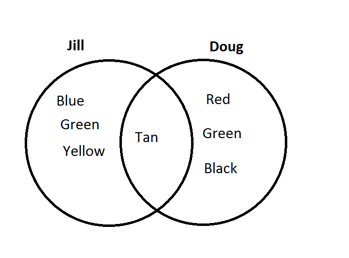
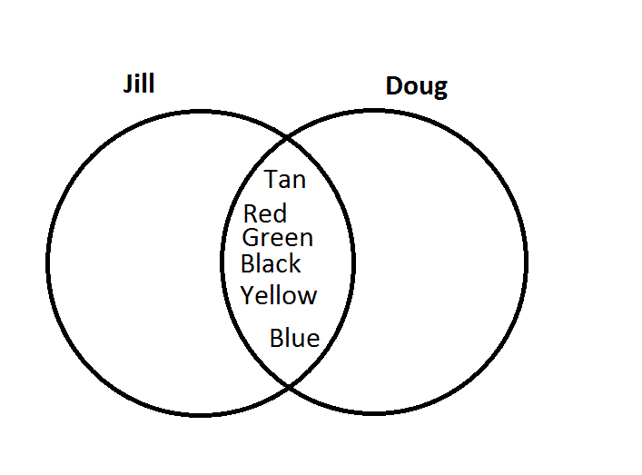
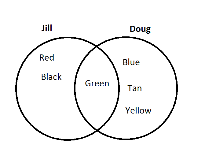
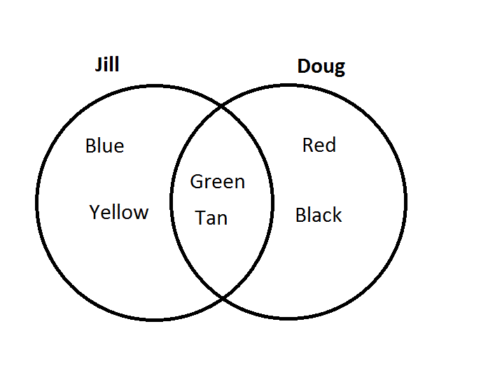
The middle portion of the diagram is the area that both circles share, so the color name that belongs in both circles should go in the middle area. Doug and Jill both like green and tan, so those colors should go in the middle. Only Jill likes blue and yellow, so these go on Jill's side. Only Doug likes red and black, so these go on Doug's side.
Example Question #641 : Isee Lower Level (Grades 5 6) Mathematics Achievement
The following Venn diagram depicts the number of students who like soccer, football, or both. How many students like soccer but not football?
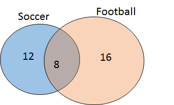
16
28
12
8
12
A Venn diagram is used to demonstrate the number of people (or things) in particular categories. The regions of the circle that are overlapping indicate the number of individuals that belong to multiple groups. Therefore, based on this diagram, 12 students like soccer only, 16 like football only, and 8 like both.
Example Question #1 : How To Use A Venn Diagram
The Venn diagram above represents the results from a recent survey given to middle school students. Category 

What fraction of the students only like chicken nuggets?


Since exactly 


Example Question #2 : Venn Diagrams
The Venn diagram above represents the results from a recent survey given to middle school students. Category 

What fraction of the students only like pizza?


Since category 


Example Question #2 : How To Use A Venn Diagram
Aracely posted a survey question using one of her social network accounts. She grouped the results into three categories. The response results are represented by the Venn diagram shown above.
Group 

What percentage of the respondents answered "no" to Aracely's survey question?


The Venn diagram has three separate categories. Category 

Category 
Thus, 

Certified Tutor


All ISEE Lower Level Quantitative Resources

