Common Core: High School - Statistics and Probability : Fitting Data Sets to Normal Distribution and Estimating Area Under the Curve: CCSS.Math.Content.HSS-ID.A.4
Study concepts, example questions & explanations for Common Core: High School - Statistics and Probability


All Common Core: High School - Statistics and Probability Resources
Example Questions
Example Question #41 : Interpreting Categorical & Quantitative Data
Suppose that the population of a certain city is normally distributed with a mean of 10 million people and a standard deviation of 4 million people. What is the probability that the current population is between 8 million and 12 million people?
75%
34.13%
50%
68.26%
23.47%
68.26%
Example Question #2 : Fitting Data Sets To Normal Distribution And Estimating Area Under The Curve: Ccss.Math.Content.Hss Id.A.4
A social scientist performs an experiment testing the frequency and correlation of several demographics. She plots a histogram measuring income versus education level. She produces the following model:

Which of the following choices best describes this model?
Normal distribution
Negative/left skewed distribution
None of these
None of these
In order to solve this problem let's review the following distributions: normal, positive/right skewed, negative/left skewed, bimodal, and uniform.
Normal Distribution:

A normal distribution is also known as a bell curve. Data that form a bell curve have three primary characteristics: the data is single peaked meaning that it has a single mode, it is symmetrical, and contains no outliers.
Positive/Right Skewed Distribution
A positive or right skewed distribution has a longer tail on the right side due to outliers while the majority of the points are concentrated on the left side of the graph. In other words, the set favors probabilities on the left of the model.
Negative/Left Skewed Distribution

A negative or left skewed distribution has a longer tail on the left side due to outliers while the majority of the points are concentrated on the right side of the graph. In other words, the set favors probabilities on the right of the model.
Bimodal Distribution

In a bimodal distribution, there are two peaks due to several modes in the data set. These multiple central tendencies are the result of two or more favorable probabilities in the set.
Uniform Distribution

In a uniform distribution the data points form a a rectangle. These models are formed when data points possess a constant probability.
The model in the question does not match any of these; therefore, the correct answer is "none of these."
Example Question #1 : Fitting Data Sets To Normal Distribution And Estimating Area Under The Curve: Ccss.Math.Content.Hss Id.A.4
A student scores a 


Using this information, determine whether or not the student scored well on the SAT.
The student's score was average: similar to the mean.
The student scored well: above a single standard deviation of the mean.
The student scored very poorly: below two standard deviations of the mean.
The student scored poorly: below a single standard deviation of the mean.
The student scored very well: above two standard deviations of the mean.
The student scored very well: above two standard deviations of the mean.
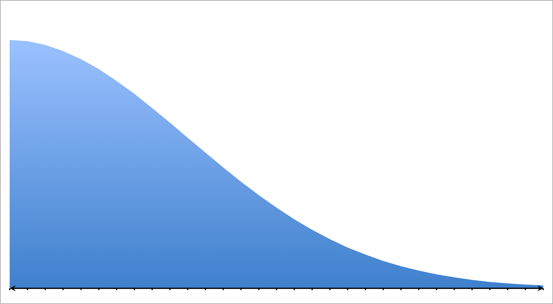
In order to solve this problem, let's consider probabilities and the normal—bell curve—distribution. Given that all events are equally likely, probability is calculated using the following formula:

When probabilities of a given population are calculated for particular events, they can be graphed in a frequency chart or histogram. If they form a standard distribution, then the graph will form to the following shape:

This shape is known as a bell curve. In this curve, the mean is known as the arithmetic average and is represented as the peak. The mean alters the position of the graph. If the mean increases or decreases, then the graph shifts to the right or to the left respectively. The mean is denoted as follows:

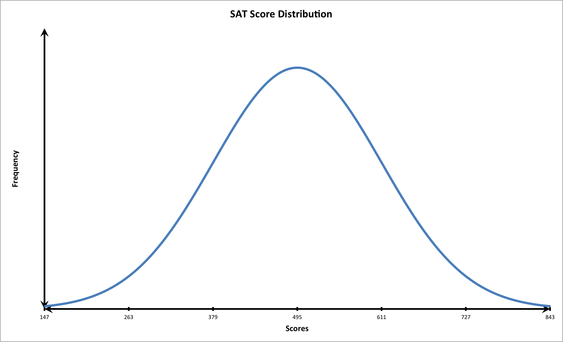
On the other hand, the standard deviation is a calculation that indicates the average amount that each value deviates from the mean. When the standard deviation is changed then the shape of the graph is altered. When the standard deviation is decreased, the graph is taller and thinner. Likewise, when the standard deviation is increased, the graph becomes shorter and wider. It is important to note that 99.7 percent of all the values in a normal population exist between three standard deviations above and below the mean. It is denoted using the following annotation:

Now that we have discussed the components of the bell curve, let's consider the scenario presented in the question.
We know that the distribution of test scores follows a normal curve. We also know the following values:


We should first plot the data on a graph that follows the shape of a bell shaped curve with three standard deviations.
We know that the student had the following score:

Let's calculate two standard deviations above the mean.
+\bar{x}=(2\times116)+495=727")
The student scored very well: above two standard deviations from the mean. Notice that at this point on the graph, the tail of the curve is closer to the horizontal or x-axis. This means that fewer students scored this high on the exam. In other words, the student performed very well.
Example Question #1 : Fitting Data Sets To Normal Distribution And Estimating Area Under The Curve: Ccss.Math.Content.Hss Id.A.4
A social scientist performs an experiment testing the frequency and correlation of several demographics. She plots a histogram measuring income versus education level. She produces the following model:
Which of the following choices best describes this model?
None of these
Uniform distribution
Positive/right skewed distribution
Negative/left skewed distribution
Normal distribution
None of these
In order to solve this problem, let's review the following distributions: normal, positive/right skewed, negative/left skewed, bimodal, and uniform.
Normal Distribution:
A normal distribution is also known as a bell curve. Data that form a bell curve have three primary characteristics: the data is single peaked meaning that it has a single mode, it is symmetrical, and contains no outliers.
Positive/Right Skewed Distribution
A positive or right skewed distribution has a longer tail on the right side due to outliers while the majority of the points are concentrated on the left side of the graph. In other words, the set favors probabilities on the left of the model.
Negative/Left Skewed Distribution
A negative or left skewed distribution has a longer tail on the left side due to outliers while the majority of the points are concentrated on the right side of the graph. In other words, the set favors probabilities on the right of the model.
Bimodal Distribution
In a bimodal distribution, there are two peaks due to several modes in the data set. These multiple central tendencies are the result of two or more favorable probabilities in the set.
Uniform Distribution
In a uniform distribution, the data points form a a rectangle. These models are formed when data points possess a constant probability.
The model in the question does not match any of these; therefore, the correct answer is "none of these."
Example Question #51 : Interpreting Categorical & Quantitative Data
A student scores a
Using this information, determine whether or not the student scored well on the SAT.
The student scored well: above a single standard deviation of the mean.
The student scored very poorly: below two standard deviations of the mean.
The student scored poorly: below a single standard deviation of the mean.
The student scored very well: above two standard deviations of the mean.
The student scored very well: above two standard deviations of the mean.
In order to solve this problem, let's consider probabilities and the normal—bell curve—distribution. Given that all events are equally likely, probability is calculated using the following formula:
When probabilities of a given population are calculated for particular events, they can be graphed in a frequency chart or histogram. If they form a standard distribution, then the graph will form to the following shape:
This shape is known as a bell curve. In this curve, the mean is known as the arithmetic average and is represented as the peak. The mean alters the position of the graph. If the mean increases or decreases, then the graph shifts to the right or to the left respectively. The mean is denoted as follows:
On the other hand, the standard deviation is a calculation that indicates the average amount that each value deviates from the mean. When the standard deviation is changed then the shape of the graph is altered. When the standard deviation is decreased, the graph is taller and thinner. Likewise, when the standard deviation is increased, the graph becomes shorter and wider. It is important to note that 99.7 percent of all the values in a normal population exist between three standard deviations above and below the mean. It is denoted using the following annotation:
Now that we have discussed the components of the bell curve, let's consider the scenario presented in the question.
We know that the distribution of test scores follows a normal curve. We also know the following values:
We should first plot the data on a graph that follows the shape of a bell shaped curve with three standard deviations.
We know that the student had the following score:
Let's calculate two standard deviations above the mean.
The student scored very well: above two standard deviations from the mean. Notice that at this point on the graph, the tail of the curve is closer to the horizontal or x-axis. This means that fewer students scored this high on the exam. In other words, the student performed very well.
Example Question #51 : High School: Statistics & Probability
A student scores a 

Using this information, determine whether or not the student scored well on the SAT.
The student scored very poorly: below two standard deviations of the mean.
The student scored poorly: below a single standard deviation of the mean.
The student scored well: above a single standard deviation of the mean.
The student scored very well: above two standard deviations of the mean.
The student's score was average: similar to the mean.
The student scored very well: above two standard deviations of the mean.
In order to solve this problem, let's consider probabilities and the normal—bell curve—distribution. Given that all events are equally likely, probability is calculated using the following formula:

When probabilities of a given population are calculated for particular events, they can be graphed in a frequency chart or histogram. If they form a standard distribution, then the graph will form to the following shape:

This shape is known as a bell curve. In this curve, the mean is known as the arithmetic average and is represented as the peak. The mean alters the position of the graph. If the mean increases or decreases, then the graph shifts to the right or to the left respectively. The mean is denoted as follows:

On the other hand, the standard deviation is a calculation that indicates the average amount that each value deviates from the mean. When the standard deviation is changed then the shape of the graph is altered. When the standard deviation is decreased, the graph is taller and thinner. Likewise, when the standard deviation is increased, the graph becomes shorter and wider. It is important to note that 99.7 percent of all the values in a normal population exist between three standard deviations above and below the mean. It is denoted using the following annotation:

Now that we have discussed the components of the bell curve, let's consider the scenario presented in the question.
We know that the distribution of test scores follows a normal curve. We also know the following values:

We should first plot the data on a graph that follows the shape of a bell shaped curve with three standard deviations.

We know that the student had the following score:

Let's calculate two standard deviations above the mean.
+\bar{x}=(2 \times 116)+495= 727")
The student scored very well: above two standard deviations from the mean. Notice that at this point on the graph, the tail of the curve is closer to the horizontal or x-axis. This means that fewer students scored this high on the exam. In other words, the student performed very well.
Example Question #53 : Interpreting Categorical & Quantitative Data
A student scores a 

Using this information, determine whether or not the student scored well on the SAT.
The student scored very poorly: below two standard deviations of the mean.
The student scored well: above a single standard deviation of the mean.
The student scored poorly: below a single standard deviation of the mean.
The student scored very well: above two standard deviations of the mean.
The student's score was average: similar to the mean.
The student scored very well: above two standard deviations of the mean.
In order to solve this problem, let's consider probabilities and the normal—bell curve—distribution. Given that all events are equally likely, probability is calculated using the following formula:

When probabilities of a given population are calculated for particular events, they can be graphed in a frequency chart or histogram. If they form a standard distribution, then the graph will form to the following shape:
This shape is known as a bell curve. In this curve, the mean is known as the arithmetic average and is represented as the peak. The mean alters the position of the graph. If the mean increases or decreases, then the graph shifts to the right or to the left respectively. The mean is denoted as follows:

On the other hand, the standard deviation is a calculation that indicates the average amount that each value deviates from the mean. When the standard deviation is changed then the shape of the graph is altered. When the standard deviation is decreased, the graph is taller and thinner. Likewise, when the standard deviation is increased, the graph becomes shorter and wider. It is important to note that 99.7 percent of all the values in a normal population exist between three standard deviations above and below the mean. It is denoted using the following annotation:

Now that we have discussed the components of the bell curve, let's consider the scenario presented in the question.
We know that the distribution of test scores follows a normal curve. We also know the following values:

We should first plot the data on a graph that follows the shape of a bell shaped curve with three standard deviations.
We know that the student had the following score:

Let's calculate two standard deviations above the mean.
+\bar{x}=(2 \times 116)+495= 727")
The student scored very well: above two standard deviations from the mean. Notice that at this point on the graph, the tail of the curve is closer to the horizontal or x-axis. This means that fewer students scored this high on the exam. In other words, the student performed very well.
Example Question #51 : High School: Statistics & Probability
A student scores a 

Using this information, determine whether or not the student scored well on the SAT.
The student scored poorly: below a single standard deviation of the mean.
The student's score was average: similar to the mean.
The student scored very well: above two standard deviations of the mean.
The student scored very poorly: below two standard deviations of the mean.
The student scored well: above a single standard deviation of the mean.
The student scored very well: above two standard deviations of the mean.
In order to solve this problem, let's consider probabilities and the normal—bell curve—distribution. Given that all events are equally likely, probability is calculated using the following formula:
When probabilities of a given population are calculated for particular events, they can be graphed in a frequency chart or histogram. If they form a standard distribution, then the graph will form to the following shape:
This shape is known as a bell curve. In this curve, the mean is known as the arithmetic average and is represented as the peak. The mean alters the position of the graph. If the mean increases or decreases, then the graph shifts to the right or to the left respectively. The mean is denoted as follows:
On the other hand, the standard deviation is a calculation that indicates the average amount that each value deviates from the mean. When the standard deviation is changed then the shape of the graph is altered. When the standard deviation is decreased, the graph is taller and thinner. Likewise, when the standard deviation is increased, the graph becomes shorter and wider. It is important to note that 99.7 percent of all the values in a normal population exist between three standard deviations above and below the mean. It is denoted using the following annotation:
Now that we have discussed the components of the bell curve, let's consider the scenario presented in the question.
We know that the distribution of test scores follows a normal curve. We also know the following values:
We should first plot the data on a graph that follows the shape of a bell shaped curve with three standard deviations.
We know that the student had the following score:

Let's calculate two standard deviations above the mean.
+\bar{x}=(2 \times 116)+495= 727")
The student scored very well: above two standard deviations from the mean. Notice that at this point on the graph, the tail of the curve is closer to the horizontal or x-axis. This means that fewer students scored this high on the exam. In other words, the student performed very well.
Example Question #55 : Interpreting Categorical & Quantitative Data
A student scores a 

Using this information, determine whether or not the student scored well on the SAT.
The student scored well: above a single standard deviation of the mean.
The student scored very poorly: below two standard deviations of the mean.
The student scored poorly: below a single standard deviation of the mean.
The student's score was average: similar to the mean.
The student scored very well: above two standard deviations of the mean.
The student scored very well: above two standard deviations of the mean.
In order to solve this problem, let's consider probabilities and the normal—bell curve—distribution. Given that all events are equally likely, probability is calculated using the following formula:
When probabilities of a given population are calculated for particular events, they can be graphed in a frequency chart or histogram. If they form a standard distribution, then the graph will form to the following shape:
This shape is known as a bell curve. In this curve, the mean is known as the arithmetic average and is represented as the peak. The mean alters the position of the graph. If the mean increases or decreases, then the graph shifts to the right or to the left respectively. The mean is denoted as follows:
On the other hand, the standard deviation is a calculation that indicates the average amount that each value deviates from the mean. When the standard deviation is changed then the shape of the graph is altered. When the standard deviation is decreased, the graph is taller and thinner. Likewise, when the standard deviation is increased, the graph becomes shorter and wider. It is important to note that 99.7 percent of all the values in a normal population exist between three standard deviations above and below the mean. It is denoted using the following annotation:
Now that we have discussed the components of the bell curve, let's consider the scenario presented in the question.
We know that the distribution of test scores follows a normal curve. We also know the following values:
We should first plot the data on a graph that follows the shape of a bell shaped curve with three standard deviations.
We know that the student had the following score:

Let's calculate two standard deviations above the mean.
+\bar{x}=(2 \times 116)+495= 727")
The student scored very well: above two standard deviations from the mean. Notice that at this point on the graph, the tail of the curve is closer to the horizontal or x-axis. This means that fewer students scored this high on the exam. In other words, the student performed very well.
Example Question #56 : Interpreting Categorical & Quantitative Data
A student scores a 

Using this information, determine whether or not the student scored well on the SAT.
The student scored well: above a single standard deviation of the mean.
The student scored very poorly: below two standard deviations of the mean.
The student's score was average: similar to the mean.
The student scored very well: above two standard deviations of the mean.
The student scored poorly: below a single standard deviation of the mean.
The student scored very well: above two standard deviations of the mean.
In order to solve this problem, let's consider probabilities and the normal—bell curve—distribution. Given that all events are equally likely, probability is calculated using the following formula:
When probabilities of a given population are calculated for particular events, they can be graphed in a frequency chart or histogram. If they form a standard distribution, then the graph will form to the following shape:
This shape is known as a bell curve. In this curve, the mean is known as the arithmetic average and is represented as the peak. The mean alters the position of the graph. If the mean increases or decreases, then the graph shifts to the right or to the left respectively. The mean is denoted as follows:
On the other hand, the standard deviation is a calculation that indicates the average amount that each value deviates from the mean. When the standard deviation is changed then the shape of the graph is altered. When the standard deviation is decreased, the graph is taller and thinner. Likewise, when the standard deviation is increased, the graph becomes shorter and wider. It is important to note that 99.7 percent of all the values in a normal population exist between three standard deviations above and below the mean. It is denoted using the following annotation:
Now that we have discussed the components of the bell curve, let's consider the scenario presented in the question.
We know that the distribution of test scores follows a normal curve. We also know the following values:
We should first plot the data on a graph that follows the shape of a bell shaped curve with three standard deviations.
We know that the student had the following score:

Let's calculate two standard deviations above the mean.
+\bar{x}=(2 \times 116)+495= 727")
The student scored very well: above two standard deviations from the mean. Notice that at this point on the graph, the tail of the curve is closer to the horizontal or x-axis. This means that fewer students scored this high on the exam. In other words, the student performed very well.


All Common Core: High School - Statistics and Probability Resources

