Algebra II : Representing Data
Study concepts, example questions & explanations for Algebra II


All Algebra II Resources
Example Questions
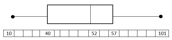
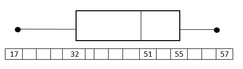
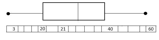
Example Question #1 : Box And Whisker Plots
Draw a Box and Whisker plot for the following data set.

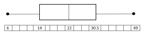
Put the data in numerical order (from smallest to largest) if it isn't already. In order to find the median, divide the data into two halves. In order to divide the values into quartiles, find the median of the two halves.
1st quartile:

Median of 1st quartile:

2nd quartile = Median: 
3rd quartile:

Median of 3rd quartile: 
To construct the Box and Whisker Plot we use the minimum and the maximum value in the data set as the ends of the whiskers. To construct the box, we plot a line at the median of the 1st quartile, the median of our total data set, and at the median of the 3rd quartile. Then we connect the tops and bottom of the lines. The result is as follows:
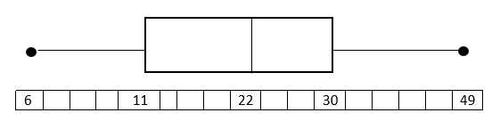
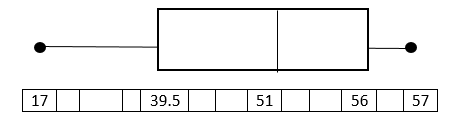
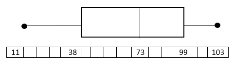
Example Question #11 : Representing Data
Draw a box and whisker plot for the following data set.

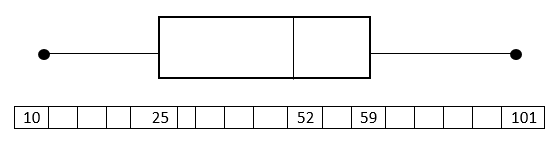
Put the data in numerical order (from smallest to largest) if it isn't already. In order to find the median, divide the data into two halves. In order to divide the values into quartiles, find the median of the two halves.
1st quartile:

Median of 1st quartile:

2nd quartile = Median:

3rd quartile:

Median of 3rd quartile:

To construct the Box and Whisker Plot we use the minimum and the maximum value in the data set as the ends of the whiskers. To construct the box, we plot a line at the median of the 1st quartile, the median of our total data set, and at the median of the 3rd quartile. Then we connect the tops and bottom of the lines. The result is as follows:
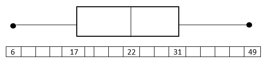
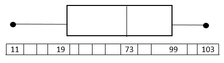
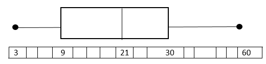
Example Question #1 : Box And Whisker Plots
Draw a Box and Whisker plot for the following data set.

Put the data in numerical order (from smallest to largest) if it isn't already. In order to find the median, divide the data into two halves. In order to divide the values into quartiles, find the median of the two halves.
1st quartile:

Median of 1st quartile:

2nd quartile= Median:

3rd quartile:

Median of 3rd quartile:

To construct the Box and Whisker Plot we use the minimum and the maximum value in the data set as the ends of the whiskers. To construct the box, we plot a line at the median of the 1st quartile, the median of our total data set, and at the median of the 3rd quartile. Then we connect the tops and bottom of the lines.
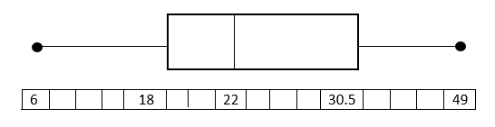
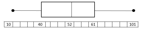
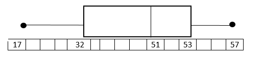
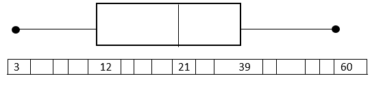
Example Question #12 : Representing Data
Draw a Box and Whisker plot for the following data set.

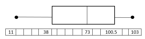
Put the data in numerical order (from smallest to largest) if it isn't already. In order to find the median, divide the data into two halves. In order to divide the values into quartiles, find the median of the two halves.
1st quartile:

Median of 1st quartile:

2nd quartile = Median:

3rd quartile:

Median of 3rd quartile: 
To construct the Box and Whisker Plot we use the minimum and the maximum value in the data set as the ends of the whiskers. To construct the box, we plot a line at the median of the 1st quartile, the median of our total data set, and at the median of the 3rd quartile. Then we connect the tops and bottom of the lines. The result is as follows:
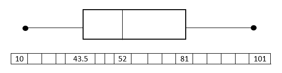
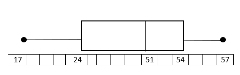
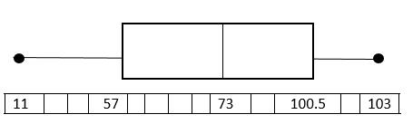
Example Question #2 : Box And Whisker Plots
Draw a Box and Whisker plot for the following data set.

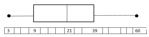
Put the data in numerical order (from smallest to largest) if it isn't already. In order to find the median, divide the data into two halves. In order to divide the values into quartiles, find the median of the two halves.
1st quartile:

Median of 1st quartile:

2nd quartile = Median:

3rd quartile:

Median of 3rd quartile: 
To construct the Box and Whisker Plot we use the minimum and the maximum value in the data set as the ends of the whiskers. To construct the box, we plot a line at the median of the 1st quartile, the median of our total data set, and at the median of the 3rd quartile. Then we connect the tops and bottom of the lines. The result is as follows:
Example Question #81 : Algebra Ii

The box and whisker plot above can be used to find all of the following information about the data set that it describes except:
The 4 quartiles of the data set
Median Value
Maximum and minimum values
The box and whisker plot gives you all of these.
Range
The box and whisker plot gives you all of these.
The median value of the data set, 86, is represented by the dashed line inside the box.
The maximum and minimum of the data set, 100 and 75 (respectively), are found at the far ends of the 2 whiskers on either end.
The range of the data set is found by subtracting the minimum from the maximum; 100-75=25, so the range is 25.
The upper and lower quartiles are given by the two boundaries between the box and the whiskers: the lower quartile (1st quartile) is the left boundary, 80 in the data set; the upper quartile (3rd quartile) is the right boundary, which is 92 in the data set.
All of the other choices are provided by the box and whisker plot, so the correct choice is "The box and whisker plot gives you all of these"
Example Question #14 : Basic Statistics
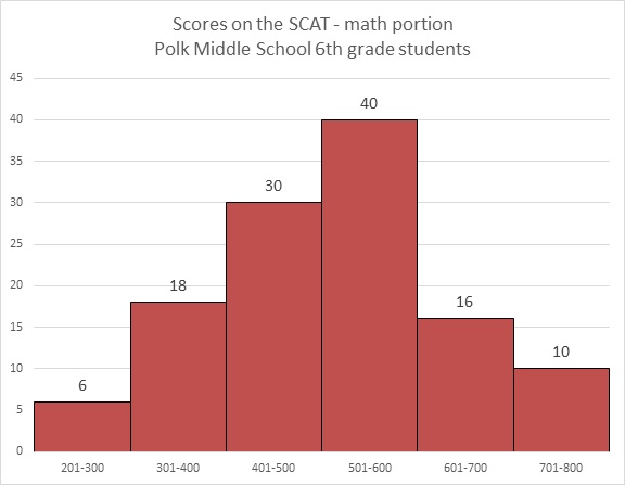
Refer to the above graph. Carla, a sixth grader at Polk, outscored 101 of the students who took the test. Which of these could her score have been?


Carla's score had to have been between 600 and 700, so of the five choices, 660 is the only possible one.
Example Question #13 : Representing Data
Refer to the above bar graph.
How many students at Polk Middle School scored above 550 on the math portion of the SCAT?


The answer to the question cannot be derived from the graph.
The answer to the question cannot be derived from the graph.
The dividing points of the intervals used to classify students on this graph occur at multiples of 100. No details are given for each interval beyond the number of students who scored in it, so, for example, within the interval 500-600, it is not made clear how many of the 40 students scored above or below 550. The answer is that insufficient information is provided.
Example Question #14 : Representing Data
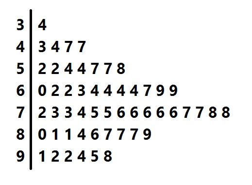
Above is a stem-and-leaf representation of the scores on a test administered to a group of students. What was the midrange of the scores?


The midrange is the mean of the highest and lowest scores.
Each "stem" in the left column represents the tens digits of the scores; each of the numbers in its row, or "leaf" represents the units digits. The lowest score is represented by the 4 "leaf" in the "3" row - that is, it is 34 - and the highest score is represented by the 8 "leaf" in the "9" row - that is, 98. The midrange is therefore

Example Question #11 : Basic Statistics
The following histogram shows the highest level of education attained by the employees of a local store.
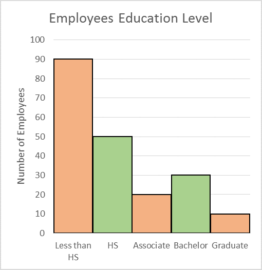
How many employees are working for the store?


Solution
The height of each bar shows the number of employees who attained that particular level of education. So to find the total number of employees, we add the numbers shown by all the bars in the histogram.

The total number of employees is 200.


Certified Tutor

All Algebra II Resources

