GED Math : GED Math
Study concepts, example questions & explanations for GED Math


All GED Math Resources
Example Questions
Example Question #51 : Representing Data
The following graph charts the amount of rain received per month over the span of a year.
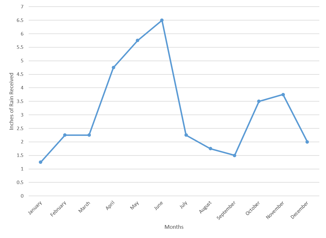
By what percent did the amount of rainfall increase between March and April?


Recall how to find the percent change for two values:

The new value in this case would be the value from April, and the old value would be the value from March.
Plug in the correct values to find the percent change:

Example Question #52 : Representing Data
The following graph charts the amount of rain received per month over the span of a year.
What is the median amount of rainfall in the last six months of the year?


Start by finding the values from the last six months of the year.
| July | 2.25 |
| August | 1.75 |
| September | 1.5 |
| October | 3.5 |
| November | 3.75 |
| December | 2 |
Next, place these values in increasing order:

Since there is an even number of values, the median will be the number between the third and fourth terms. In this case, the median will be between 

The value in between those numbers is 
Example Question #253 : Statistics
The following graph charts the number of attendees at a theme park over the course of a year.
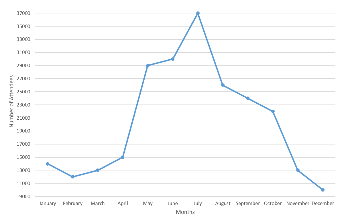
By what percentage did attendance at the park increase from April to May?


Recall how to find the percent change:

In this case, the new value is the number of attendees in May, and the old value is the number of attendees in April.
From the graph, you can see that there were 

Plug these numbers into the equation to find the percent change.

Example Question #53 : Representing Data
The following graph charts the number of attendees at a theme park over the course of a year.
The increase in the number of attendees between April and May is how much larger than the increase in the number of attendees between June and July?


Start by looking at the graph and finding out how many attendees there were for the listed months.
There were 


Now, the increase in attendees between April and May is 

Thus, the difference in the amount of increases is 
Example Question #11 : Line Graphs
The following graph charts the number of attendees at a theme park over the course of a year.
What is the average number of attendees from March to August, inclusive?


Start by figuring out how many people attended the park in those months:
| March | 13000 |
| April | 15000 |
| May | 29000 |
| June | 30000 |
| July | 37000 |
| August | 26000 |
Recall how to find the average for a set of numbers:

Plug in the values for each of the months and divide by the number of months.

Example Question #51 : Representing Data
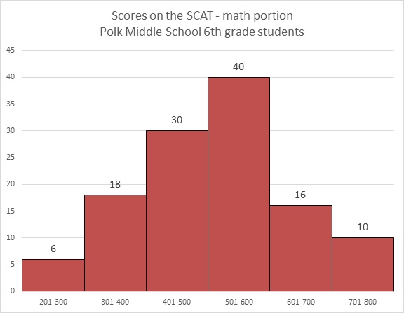
Refer to the above graph. Monique, a sixth grader at Polk, scored a 466 on the math portion of the SCAT. Which of the following could have been her rank among the students?


By scoring 466 on the test, Monique was outscored by the 40 students who finished in the 501-600 range, the 16 students who finished in the 601-700 range, and the 10 students who finished in the 701 to 800 range -

so the highest she finished was 67th place.
She finshed among the 30 students whose scores were in the 401-500, so she was outscored by at most 29 more students - or, in all,

So the lowest she finished was 96th place.
Of the five choices, the only one possible is 80th place.
Example Question #52 : Representing Data
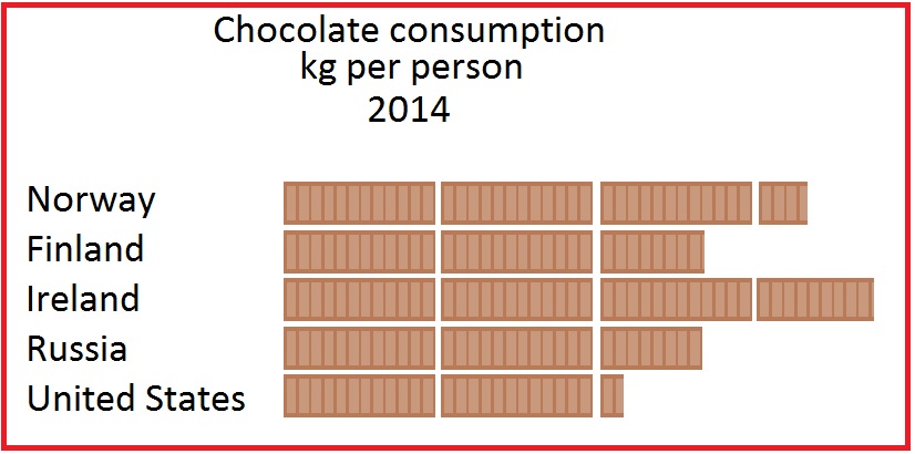
Source of figures: Euromonitor International via ConfectioneryNews.com
The above pictograph represents the amount of chocolate eaten per person in 2014 in five countries. The legend is missing, but it is known that the average person in the United States ate 4.3 kilograms of chocolate in 2014.
The average Austrian ate 7.8 kilograms of chocolate in 2014, according to the same source. How many chocolate bars would be used to represent Austria if it were added to this pictogram?
Slightly less than three
Slightly less than four
Slightly more than three
Slightly more than four
Slightly less than four
The United States is represented by 2 bars of chocolate and about one-fourth of another in the pictograph, so about two and one-fourth bars represents 4.3 kilograms. Since

it would be reasonable to assume that one bar represents two kilograms of chocolate consumption per person.
7,8 kilograms would be represented by about

Slightly less than four would be the correct response.
Example Question #53 : Representing Data
Source of figures: Euromonitor International via ConfectioneryNews.com
The above pictograph represents the amount of chocolate eaten per person in 2014 in five countries. The legend is missing, but it is known that the average person in Russia ate 5.3 kilograms of chocolate in 2014.
Which of the following is probably the legend for the pictograph?
![]()
![]()
![]()
![]()
![]()
Russia is represented by 2 bars of chocolate and about two-thirds of another in the pictograph, so it is reasonable to assume that about two and two-thirds (approximately 2.7) bars represents 5.3 kilograms. Since

it would be reasonable to surmise that one bar represents two pounds.
The correct choice is this diagram:
![]()

Certified Tutor

Certified Tutor

All GED Math Resources

