GED Math : Bar Graphs
Study concepts, example questions & explanations for GED Math


All GED Math Resources
Example Questions
Example Question #1 : Bar Graphs
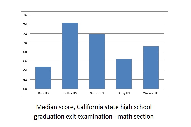
A school district includes five high schools - Burr, Colfax, Garner, Gerry, and Wallace. Seniors at all five high schools took the California state high school exit examination this year - the results are reflected in the above bar graph.
Which of the following questions cannot be answered about the math scores of the five schools by examining the above graph?
Of the five schools, which school's median math score was the lowest this year?
Of the five schools, how many had median math scores above 70 this year?
What was the difference this year between the median math score of the highest-performing school of the five and that of the lowest-performing school?
Of the five schools, which school's median score improved the most from last year?
Of the five schools, which school's median score improved the most from last year?
The question "Of the five schools, which school's median score improved the most from last year?" requires knowledge of last year's median math scores, which are not given by the graph. The other three questions only require knowledge of this year's scores, which are given.
Example Question #2 : Bar Graphs
Refer to the above bar graph. The exit examination was given to all high school seniors in the above five schools.
Juanita attended Wallace High School and scored a 75 on the math portion. Wallace High School had 188 seniors take the examination. How many seniors could Juanitia have conceivably outscored?


The median score at Wallace was 69, so Juanita scored above the median. By definition, she outscored at least half the seniors, which means that she must have outscored at least 
Example Question #3 : Bar Graphs
Refer to the above bar graph.
Three cousins took this examination this year- Carlos scored 67, Alberto scored 70, and Julio scored 71. All three attended the same high school and all three scored below the median for their school. Which of the following high schools could they have attended?
Burr
Gerry
Garner
Wallace
Garner
Julio scored the highest of the three with 71, so we are looking for a high school whose median score was above 71. Of the four choices, only Garner fits this criterion.
Example Question #2 : Bar Graphs
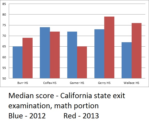
The above bar graph compares the median math scores from both 2012 and 2013 for an examination administered in the five high schools of a school district.
How many of the five schools did not see their median math score reach at least 70 in either 2012 or 2013?
Two
Three
One
None
One
Of the five schools, only Burr had median scores below 70 in both 2012 and 2013. The correct choice is "one".
Example Question #3 : Bar Graphs
Refer to the above bar graph.
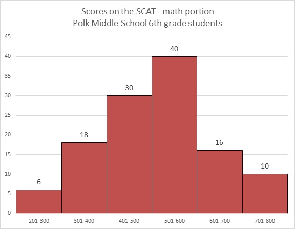
How many students at Polk Middle School scored higher than 600 on the math portion of the SCAT?


The number of students who scored in the 601-700 range is 16; in the 701-800 range, 10. Add them to get 26 students total.
Example Question #2074 : Ged Math
Refer to the above bar graph.
What percent of the students achieved a score above 500?


40 students achieved a score of 501-600; 16 achieved a score of 601-700; 10 achieved a score of 701-800. Add these:

The number of students who took the test is the sum of the students who finished in the six ranges:

The question is now to find out what percent 66 is of 120, which can be calculated as follows:

Example Question #4 : Bar Graphs
Refer to the above graph. Clarissa, a sixth grader at Polk, scored a 673 on the math portion of the SCAT. Which of the following could have been her rank among the students?


By making a 673, Clarissa finished in the second-highest range shown (601-700). She was outscored by at least 10 students (the ones in the 701-800 range), but by at most 25 students (the 10 in the 701-800 range plus the other 15 in the 601-700 range). She finished between 11th and 26th, inclusive, so the only plausible choice is 14th.
Example Question #236 : Statistics
Refer to the above graph. Yasmin, a sixth grader at Polk, outscored 89 of the students who took the test. Which of these could her score have been?


Her score fell in the range between 501 and 600, so of the four choices, the only plausible score was 565.
Example Question #1 : Bar Graphs
Which question cannot be answered about Polk Middle School sixth graders' performance on the math portion of the SCAT by looking at the above bar graph?
What was the lowest score on the test?
What fraction of the students scored at 600 or on the test?
What percent of the students scored from 401 to 600 on the test?
How many students scored above 300 on the test?
What was the lowest score on the test?
The lowest score is not indicated anywhere on the graph, so the question "What was the lowest score on the test?" is the one that cannot be answered. The other three can be determined, in part or completely, by adding the number of students in one or more ranges, and in two cases, also adding the number of students total.
Example Question #2 : Bar Graphs
Which question can be answered about Polk Middle School sixth graders' performance on the math portion of the SCAT by looking at the above bar graph?
How many students took the test?
What was the mean score on the test?
What was the mode of the scores on the test?
What was the median score on the test?
How many students took the test?
The graph only provides information about how many students scored in each range (201-300, 301-400, etc.) on the test; it provides no information about the mean, median, or mode. The only question that can be answered is the number of students total who took the test - this can be answered by adding the numbers on top of the bars.


Certified Tutor

All GED Math Resources

