Common Core: 6th Grade Math : Statistics & Probability
Study concepts, example questions & explanations for Common Core: 6th Grade Math


All Common Core: 6th Grade Math Resources
Example Questions
Example Question #2 : Display Numerical Data In Plots: Ccss.Math.Content.6.Sp.B.4
An Environmental Science Class wanted to look at the average temperature for each day this past month. This data is displayed in the provided chart. Select the answer that contains the histogram that most accurately displays the class's data.


Histograms are similar to bar graphs; however, histograms differ because they can use ranges and the bars must touch (i.e. there are no gaps in the graph).
In order to make a histogram that displays this data, we want to make an x-axis that contains variables that represent a range of the average daily temperatures and a y-axis that represents the number of days during the month that the temperature was within a particular range. Next, we can place a bar above each number on the x-axis that goes up to the correct number of days that the temperature fell within that certain range. If done correctly, then the histogram should look something like the following:
Example Question #2 : Display Numerical Data In Plots: Ccss.Math.Content.6.Sp.B.4
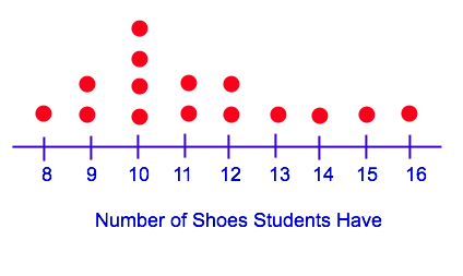
Mr. Jones wants to know what size of shoe all of his students wear. He asked each of his students to write their shoe size down. This data is displayed in the provided chart. Select the answer that contains the dot plot that most accurately displays Mr. Jones's class data.


A dot plot is a graph that displays data using a number line. In these plots, data is tabulated by placing a dot above each value on the number line that is represented by a particular observation. In this case, the shoe size will be the number line values and each dot represents the number of students who have a particular shoe size.
The first step to making a dot plot is to organize the data from least to greatest:

Next, we place a dot above each number on the number line to represent each student that wears a particular size of shoe. If done correctly, then the dot plot should look something like the following:
Example Question #3 : Display Numerical Data In Plots: Ccss.Math.Content.6.Sp.B.4
Mr. Jones wants to know what size of shoe all of his students wear. He asked each of his students to write their shoe size down. This data is displayed in the provided chart. Select the answer that contains the histogram that most accurately displays Mr. Jones's class data.


Histograms are similar to bar graphs; however, histograms differ because they can use ranges and the bars must touch (i.e. there are no gaps in the graph).
In order to make a histogram that displays this data, we want to make an x-axis that contains variables that represent the various shoe sizes and a y-axis that represents the number of students who wear a particular shoe size. Next, we can place a bar above each number on the x-axis that goes up to the correct number of students that wear the particular shoe size. If done correctly, then the histogram should look something like the following:
Example Question #3 : Display Numerical Data In Plots: Ccss.Math.Content.6.Sp.B.4
Mr. Smith wants to know how tall all of his students are, in inches. He asked each of his students to write down their height. This data is displayed in the provided chart. Select the answer that contains the dot plot that most accurately displays Mr. Smith's class data.


A dot plot is a graph that displays data using a number line. In these plots, data is tabulated by placing a dot above each value on the number line that is represented by a particular observation. In this case, the heights will be on the number line and each dot represents the number of students who are that particular height.
The first step to making a dot plot is to organize the data from least to greatest:

Next, we place a dot above each number on the number line to represent each student that is each particular height. If done correctly, then the dot plot should look something like the following:
Example Question #4 : Display Numerical Data In Plots: Ccss.Math.Content.6.Sp.B.4
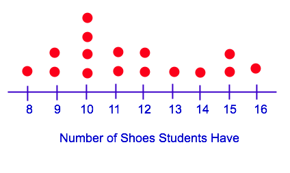
Mr. Jones wants to know what size of shoe all of his students wear. He asked each of his students to write their shoe size down. This data is displayed in the provided chart. Select the answer that contains the box plot that most accurately displays Mr. Jones's class data.


A box plot is often called a box and whiskers plot because of way the graph looks once constructed. In order to construct a box plot, we need to calculate the following values from our data set:
- Minimum value
- Maximum value
- Median
- Lower quartile median
- Upper quartile median
In order to find these values, we need to first organize the data from least to greatest:
Now that we have organized the data, we can pull out the minimum and maximum values:


Next, we can solve for the median by finding the middlemost number in our data:

Now that we have the median, 


We want to find the median—or middlemost number—of the lower quartile and the median—or middlemost number—of the upper quartile:

If done correctly, then you should have calculated the following values:
- Minimum value:
- Maximum value:
- Median:
- Lower quartile median:
- Upper quartile median:


Now, we can start constructing the box plot. The first thing we need to do is create a number line that ranges from our minimum to our maximum value and put a dot above all of the values we calculated above:

Finally, we connect the minimum value to the lower quartile with a line and the maximum value to the upper quartile with a line. Then, we will draw a box that connects the lower and upper quartiles. Finally, we draw a vertical line from the top of the box to the bottom, that goes through the median point. If done correctly, then the box plot should look something like the following:
Example Question #5 : Display Numerical Data In Plots: Ccss.Math.Content.6.Sp.B.4
Mr. Smith wants to know how tall all of his students are, in inches. He asked each of his students to write down their height. This data is displayed in the provided chart. Select the answer that contains the box plot that most accurately displays Mr. Smith's class data.


A box plot is often called a box and whiskers plot because of way the graph looks once constructed. In order to construct a box plot, we need to calculate the following values from our data set:
- Minimum value
- Maximum value
- Median
- Lower quartile median
- Upper quartile median
In order to find these values, we need to first organize the data from least to greatest:

Now that we have organized the data, we can pull out the minimum and maximum values:


Next, we can solve for the median by finding the middlemost number in our data:

Now that we have the median, 


We want to find the median—or middlemost number—of the lower quartile and the median—or middlemost number—of the upper quartile:

If done correctly, then you should have calculated the following values:
- Minimum value:
- Maximum value:
- Median:
- Lower quartile median:
- Upper quartile median:


Now, we can start constructing the box plot. The first thing we need to do is create a number line that ranges from our minimum to our maximum value and put a dot above all of the values we calculated above:

Finally, we connect the minimum value to the lower quartile with a line and the maximum value to the upper quartile with a line. Then, we will draw a box that connects the lower and upper quartiles. Finally, we draw a vertical line from the top of the box to the bottom, that goes through the median point. If done correctly, then the box plot should look something like the following:
Example Question #1471 : Grade 6
Mr. Smith wants to know how tall all of his students are, in inches. He asked each of his students to write down their height. This data is displayed in the provided chart. Select the answer that contains the histogram that most accurately displays Mr. Smith's class data.


Histograms are similar to bar graphs; however, histograms differ because they can use ranges and the bars must touch (i.e. there are no gaps in the graph).
In order to make a histogram that displays this data, we want to make an x-axis that contains variables that represent the various heights and a y-axis that represents the number of students who who are a particular height. Next, we can place a bar above each number on the x-axis that goes up to the correct number of students that are the particular height. If done correctly, then the histogram should look something like the following:
Example Question #1471 : Grade 6
Miss. Little wants to know how many pairs of shoes each of her students owns. She decides to ask each of her students to write the number of pairs of shoes that he or she owns. This data is displayed in the provided chart. Select the answer that contains the histogram that most accurately displays Miss Little's class data.


Histograms are similar to bar graphs; however, histograms differ because they can use ranges and the bars must touch (i.e. there are no gaps in the graph).
In order to make a histogram that displays this data, we want to make an x-axis that contains variables that represents number of pairs of shoes that a student owns and a y-axis that represents the number of students that owns each particular number of shoe pairs. Next, we can place a bar above each number on the x-axis that goes up to the number of students that own that number of shoes. If done correctly, then the histogram should look something like the following:
Example Question #1 : Report The Number Of Observations: Ccss.Math.Content.6.Sp.B.5a
Miss. Little wants to know how many pairs of shoes each of her students owns. This data is displayed in the provided dot plot. Based on this dot plot, how many observations were made?


For this plot, the number of observations made represents the number of students that participated in the survey. Each dot represents one student, so we can count up the number of dots in the plot to determine the number of observations that were made.
If done correctly, you should have counted 


All Common Core: 6th Grade Math Resources

