Common Core: 6th Grade Math : Statistics & Probability
Study concepts, example questions & explanations for Common Core: 6th Grade Math


All Common Core: 6th Grade Math Resources
Example Questions
Example Question #4 : Understand Data Is Collected To Answer A Question And Has A Center, Spread, And Shape: Ccss.Math.Content.6.Sp.A.2
A flower shop counted the number of flowers sold during a 
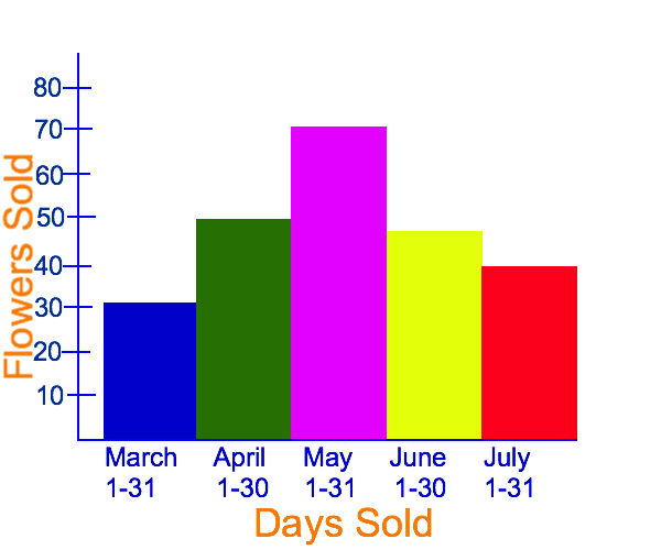
March
June
May
April
July
May
The data in the distribution shows the number of flowers sold in each month. By looking at the graph, we can see that there are 

Example Question #4 : Understand Data Is Collected To Answer A Question And Has A Center, Spread, And Shape: Ccss.Math.Content.6.Sp.A.2
A flower shop counted the number of flowers sold during a 


To answer this question, we can look at our graph and see how far each bar in the histogram raises:

We can see that in May, the flower shop sold 
Example Question #21 : Statistics & Probability
A flower shop counted the number of flowers sold during a 
April
May
March
June
July
May
To answer this question, we can look at our graph and see how far each bar in the histogram raises:
We can see that in May, the flower shop sold 
Example Question #22 : Statistics & Probability
Select the description that best describes the distribution of the data shown in the graph.

Right skewed
Left skewed
Symmetric
Left skewed
In order to answer this question correctly, we need to define our answer options:
Symmetric: A symmetric distribution will have a middle, or center, and each side from the middle will look fairly similar. Many symmetrical distributions are bell shaped, with the middle being tall, and the two sides thinning out.
Left skewed: A left skewed distribution will have most of the data on the right side of the number line.
Right skewed: A right skewed distribution will have most of the data on the left side of the number line.
The data shown in the number plot has most of the data on the right side; thus, left skewed is the correct answer.
Example Question #1 : Compare The Measure Of Center And Measure Of Variation: Ccss.Math.Content.6.Sp.A.3
Select the description that best describes the measure of center for a numerical data set.
The measure of center is the part of a graph or data set that contains the highest valued point
The measure of center is a value at the center of a data set that describes how all of the values in a data set vary with a single number
The measure of center is a value at the center of a data set and summarizes all of the values in a data set with a single number
The measure of center is the part of a graph or data set that contains the most points
The measure of center is a value at the center of a data set and summarizes all of the values in a data set with a single number
By definition, the measure of center for a numerical data set is a value at the center of a data set and summarizes all of the values in a data set with a single number. Algebraically, the most common ways to solve for the measure of center is to solve for the mean or median.
Example Question #1452 : Grade 6
Select the description that best describes the measure of variation for a numerical data set.
The measure of variation describes how the data set's values vary with a single number.
The measure of variation is the part of a graph or data set that contains the highest valued point
The measure of variation is the part of a graph or data set that contains the most points
The measure of variation is a value at the center of a data set and summarizes all of the values in a data set with a single number
The measure of variation describes how the data set's values vary with a single number.
By definition, the measure of variation describes how the data set's values vary with a single number.
Example Question #2 : Compare The Measure Of Center And Measure Of Variation: Ccss.Math.Content.6.Sp.A.3
Mr. Sommers wanted to see how much money his students spent on school lunch in a given day. The distribution of this data is shown in the plot provided. Use mean to solve for the center of this distribution.


In order to solve for the mean, we need to add up all of the money spent on lunch, and then divide by the number of addends in our set:


The center of distribution, using the mean, is

Example Question #1454 : Grade 6
Mr. Sommers wanted to see how much money his students spent on school lunch in a given day. The distribution of this data is shown in the plot provided. What is the highest amount of money spent on lunch by one of Mr. Sommers's students?


The plot shows the amount of money spent on school lunch on a number line. 


Example Question #27 : Statistics & Probability
Mr. Sommers wanted to see how much money his students spent on school lunch in a given day. The distribution of this data is shown in the plot provided. What is the least amount of money spent on lunch by one of Mr. Sommers's students?


The plot shows the amount of money spent on school lunch on a number line. 


Example Question #28 : Statistics & Probability
Mr. Sommers wanted to see how much money his students spent on school lunch in a given day. The distribution of this data is shown in the plot provided. Use the information provided in the plot to fill in the blank of the table.
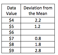


The table shows how far away each data value is from the mean. In order to solve for the missing piece of the table, we first need to solve for the mean:
In order to solve for the mean, we need to add up all of the money spent on lunch, and then divide by the number of addends in our set:


The mean for this data set is

Next, we can subtract the data value from the mean to find the deviation from the mean:

The correct answer is


All Common Core: 6th Grade Math Resources

