Pre-Algebra : Analyzing Graphs and Figures
Study concepts, example questions & explanations for Pre-Algebra


All Pre-Algebra Resources
Example Questions
Example Question #1 : Graphing
What is the slope of the line:


Using the equation: 
When you look at the equation:


Example Question #2 : Graphing
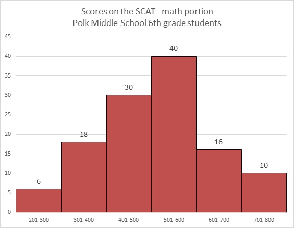
Refer to the above graph. Clark, a sixth grader at Polk, outscored 100 of the students who took the test. What could his score have been?


Therefore, his score fell in the range from 601 to 700, making 635 the only plausible choice of the five.
Example Question #3 : Graphing
Refer to the above bar graph.
How many students at Polk Middle School scored from 301 to 700 on the math portion of the SCAT?


The answer to the question cannot be derived from the graph.


Example Question #4 : Graphing
Find the slope of the line between the points ")
")


Recall the slope formula:

Plug in the two given points:


The slope of the line is 
Example Question #5 : Graphing
Refer to the above bar graph.
What percent of the students achieved a score above 400?


30 students achieved a score of 401-500; 40 students achieved a score of 501-600; 16 achieved a score of 601-700; 10 achieved a score of 701-800. Add these:

The number of students who took the test is the sum of the students who finished in the six ranges:

The question is now to find out what percent 96 is of 120, which can be calculated as follows:

Example Question #6 : Analyzing Graphs And Figures
What is the slope of the line that contains the points
")

")


Using the equation:

you plug in your points (2,4) and (3,4)


Example Question #5 : Graphing
Below is the list of candidates for Student Council president, along with the number of votes each won:

What percent of the students voted for neither Phillips nor Young (nearest tenth)?


Example Question #6 : Graphing

Four candidates ran for mayor of Jackson City; the above circle graph shows the share of the vote that each won.
According to a city ordinance, a candidate must win more than 50% of the vote to win the election; if this does not happen, the two candidates who win the most votes will face each other in a runoff election. Based on the above graph, which of the following is the outcome of the vote?
Mills and Jones will face each other in a runoff.
Mills and King will face each other in a runoff.
Jones won the election outright.
Mills won the election outright.
Jones and King will face each other in a runoff.
Mills and Jones will face each other in a runoff.
By comparing the sizes of the sectors, it can be seen that Mills won the largest share of the vote - but not at least one half of it - and Jones won the second-largest share. Therefore, they will face each other in a runoff.
Example Question #7 : Graphing
Four candidates ran for mayor of Johnston City. The results are below.

Which of the following is the best estimate of the percent of the vote won by Johnson?


Since we are asking for an estimate, one way to work this problem is to round each candidate's vote tally to the nearest thousand, then adding the rounded numbers:


Johnson's share of the vote is about 6,000 of those approximately 14,000 votes, or

As a percent, 


Therefore, 40% is the best estimate of the choices we are given.
Example Question #8 : Graphing
Five candidates ran for mayor of Madison City; the above circle graph shows the share of the vote that each won. Which of the following would be the most reasonable estimate of the percent of the vote Lyle won?


The sector representing Lyle is roughly one-tenth to one-eighth of the circle - in other words, 10-12 % of it. This is the approximate percent of the vote won by Lyle.

Certified Tutor

Certified Tutor

All Pre-Algebra Resources

