GED Math : Line Graphs
Study concepts, example questions & explanations for GED Math


All GED Math Resources
Example Questions
Example Question #2091 : Ged Math
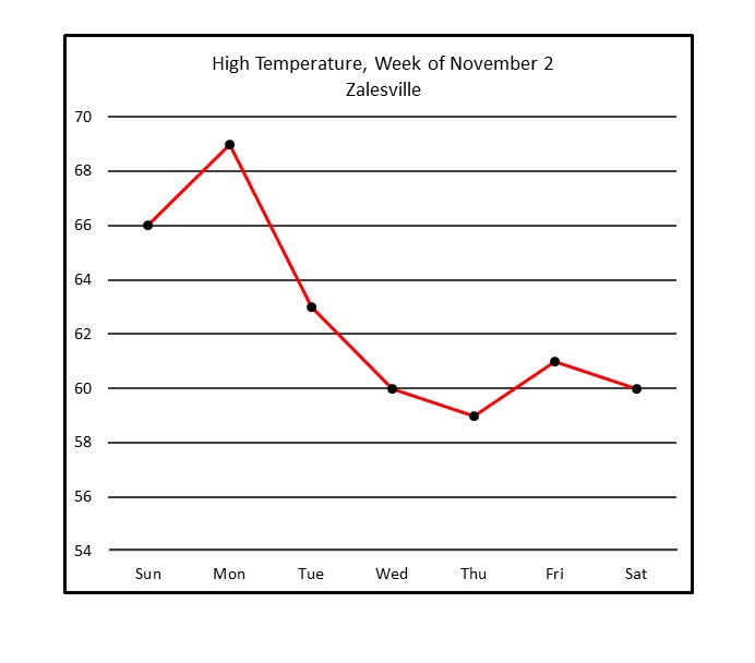
Refer to the above line graph, which tracks the high temperature in a town over one calendar week.
Of the days shown, between which two consecutive days did the peak temperature decrease the most?
Between Monday and Tuesday
Between Tuesday and Wednesday
Between Friday and Saturday
Between Wednesday and Thursday
Between Monday and Tuesday
The segments that represent decreases are the ones that go from upper left to lower right. There are four, and the steepest is the one between Monday and Tuesday. This is the correct response.
Example Question #1 : Line Graphs
Refer to the above line graph, which tracks the high temperature in a town over one calendar week.
Of the days shown, how many had a peak temperature at or above 


The dot representing Thursday is the only one of the seven that appears below 60 on the graph, so 6 is the correct response.
Example Question #2 : Line Graphs
Refer to the above line graph, which tracks the high temperature in a town over one calendar week.
How many days shown have a peak temperature higher than Friday's high temperature?


Only the three dots representing the peak temperatures of Sunday, Monday, and Tuesday are higher than the one representing that of Thursday, so the correct response is three.
Example Question #254 : Statistics
Use the following line graph to answer the question:
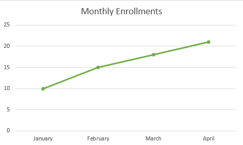
How many enrollments were there in January?


Let's look at the line graph.
We can see the bottom axis displays the individual months. We can see the scale on the left displaying the number of enrollments.
So, to find the number of enrollments in January, we will first locate January on the bottom axis. We can see that it is the first one listed.
Now, we will see which number it corresponds with. We can see that it lines up with 10.
Therefore, the number of enrollments in January is 10.
Example Question #43 : Representing Data
Use the following line graph to answer the question:
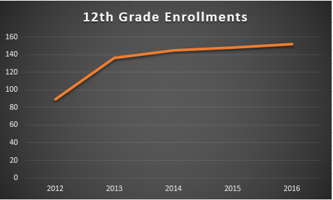
Approximately, how many 12th grade enrollments were there in 2013?


Let's look at the graph:
If we look at the year 2013, we can see the data point is between 120 and 140.
We can also see that it is much closer to 140 than it is to 120.
From looking at the location of the data point, we can approximate that there were 136 12th grade enrollments in 2013.
Example Question #2094 : Ged Math
The following graph charts the amount of rain received per month over the span of a year.
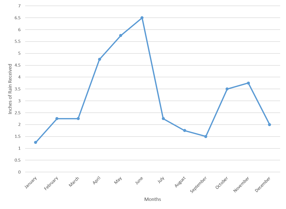
What is the average amount of rain, in inches, received in the first six months of the year?


Start by finding the values for the first six months of the year.
In January, there was 
In February and March, there were 
In April, there was 
In May, there was 
In June, there was 
Recall how to find the average for a set of numbers:

Plug in the values for the rainfall and divide by the number of values.

Example Question #254 : Statistics
The following graph charts the amount of rain received per month over the span of a year.
By what percent did the amount of rainfall increase between March and April?


Recall how to find the percent change for two values:

The new value in this case would be the value from April, and the old value would be the value from March.
Plug in the correct values to find the percent change:

Example Question #255 : Statistics
The following graph charts the amount of rain received per month over the span of a year.
What is the median amount of rainfall in the last six months of the year?


Start by finding the values from the last six months of the year.
| July | 2.25 |
| August | 1.75 |
| September | 1.5 |
| October | 3.5 |
| November | 3.75 |
| December | 2 |
Next, place these values in increasing order:

Since there is an even number of values, the median will be the number between the third and fourth terms. In this case, the median will be between 

The value in between those numbers is 
Example Question #252 : Statistics
The following graph charts the number of attendees at a theme park over the course of a year.
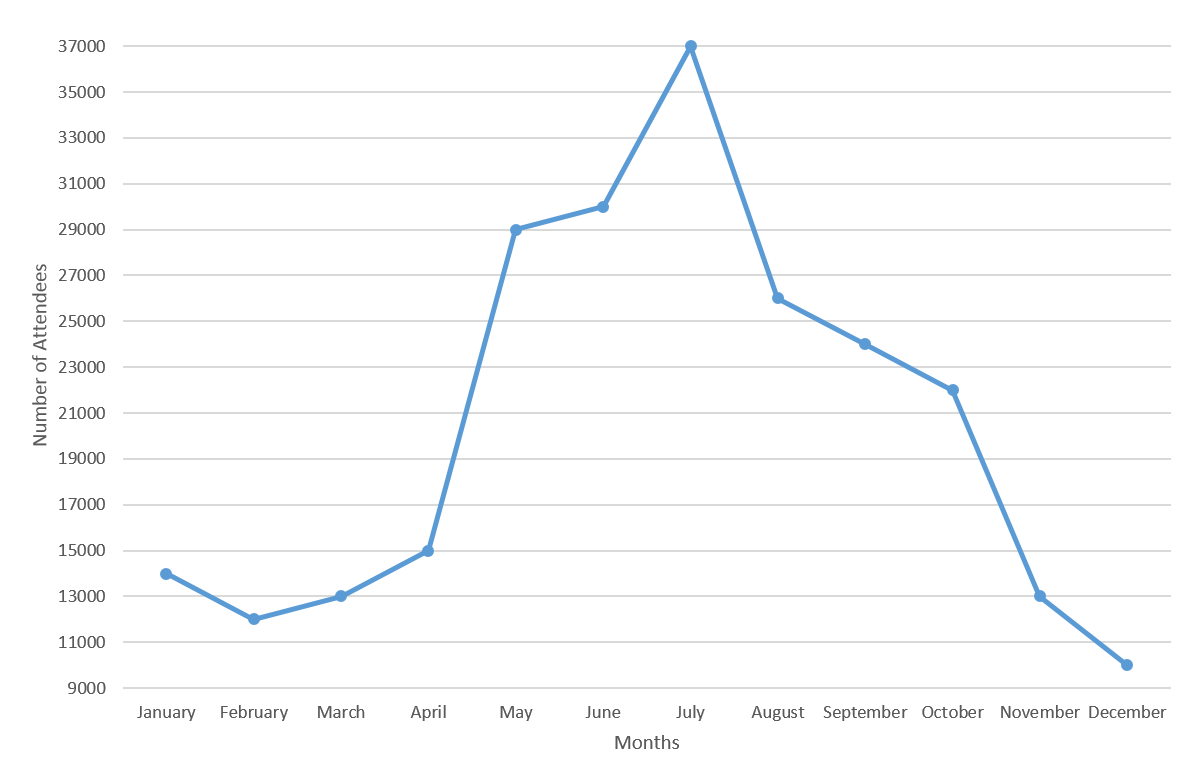
By what percentage did attendance at the park increase from April to May?


Recall how to find the percent change:

In this case, the new value is the number of attendees in May, and the old value is the number of attendees in April.
From the graph, you can see that there were 

Plug these numbers into the equation to find the percent change.

Example Question #255 : Statistics
The following graph charts the number of attendees at a theme park over the course of a year.
The increase in the number of attendees between April and May is how much larger than the increase in the number of attendees between June and July?


Start by looking at the graph and finding out how many attendees there were for the listed months.
There were 


Now, the increase in attendees between April and May is 

Thus, the difference in the amount of increases is 


All GED Math Resources

