SAT Mathematics : Interpreting Graphs & Tables
Study concepts, example questions & explanations for SAT Mathematics


All SAT Mathematics Resources
Example Questions
Example Question #1 : Interpreting Graphs & Tables
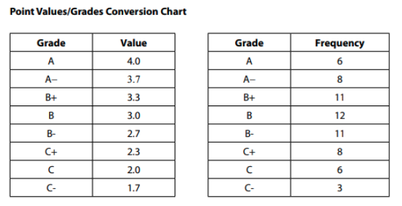
The below tables show the way that a certain high school converts letter grades to numerical grades, and the math grades of a particular high school’s 65-person graduating class.
Which of the following best describes the data outlined in the tables?
The mean math grade of the 65 students was 3.0.
The median math grade of the 65 students is less than a 3.0.
The median math grade of the 65 students is higher than the mean math grade of the 65 students.
If three new students were added to the class and each scored an A, the new class average would be greater than or equal to 3.0.
The median math grade of the 65 students is higher than the mean math grade of the 65 students.
This question is a great example of a case where the SAT might try to trap you into doing more work than is necessary. Since the problem asks you whether that mean is exactly 3.0, it is possible to determine this without tedious work. If the average were 3.0, the values on either side of the twelve B (3.0) grades would all even out. And they ALMOST do: there are 6 As (4.0 each) and 6 Cs (2.0 each, so those grades all average out to 3.0); there are 8 A-s and 8 C+s, so those grades (3.7 and 2.3) all average out to 3.0; and there are 11 B+s and 11 B-s, so those all average out to 3. On the list from A on down to C, all those grades average out to 3.0…but then there are the 3 C− grades, and those do not get “averaged out” by anything above an A. So without fully calculating, you can tell that the mean is lower than 3.0. So, we can eliminate “The mean math grade of the 65 students was 3.0.”
Since two of our options deal with the median, we can focus there next. The middle of the 65 terms will be the 33rd term (32 terms above it and 32 terms below it). So when you go from the top down and see that there are 25 grades from A through B+ and then 12 grades of B, you should see that the 33rd term will fall in that group of Bs. This means that the median is 3.0.
This knowledge allows us to both eliminate “The median math grade of the 65 students is less than a 3.0” and select “The median math grade of the 65 students is higher than the mean math grade of the 65 students.” Since the mean is somewhat less than 3.0, and the median *is* 3.0, the mean is less than the median.
“If three new students were added to the class and each scored an A, the new class average would be greater than or equal to 3.0” can be eliminated on the logic of the first paragraph: The 62 grades from A down to C all average out to a 3.0, leaving the three C− grades of 1.7 to weigh down that average. In order to balance three 1.7s you’d need three 4.3s; three 4.0s, as this option presents, aren’t quite enough, so the average would still be below 3.0.
Example Question #1 : Interpreting Graphs & Tables
The below tables show the way that a certain high school converts letter grades to numerical grades, and the math grades of a particular high school’s 65-person graduating class.
Henry, one of the students at the school, wants to achieve a 3.5-grade point average or better for the semester. If he takes five classes, and his grades for four of them are A−, A−, B+, and B, what is the lowest grade that he can receive for his fifth class and still achieve his goal?
B+
A
B-
B
A
This question is an excellent example of a case where the SAT might try to trap us into doing more math than needed. If Henry’s current grades are 3.7, 3.7, 3.3, and 3.0, his current average GPA is lower than needed for him to achieve his goal. (3.7 and 3.3 average to 3.5, so 3.7 and 3.0 will average to lower than 3.5, making his current GPA lower than needed to reach his goal.) So, his final grade needs to bring his average *up* and bridge the gap between his current, below 3.5, average, and his goal. Only “A” has the potential to do so. Keep in mind - A- wasn’t even in the running! So, before you go to tackle complex calculations, make sure you keep in mind that the answer choices are a part of the question, and you’ll want to take a look at what options are even possible before doing the math.
Example Question #3 : Drawing Conclusions From Graphs & Tables
The table below displays the class status and declared major for the 37,500 undergraduate students at a state university.
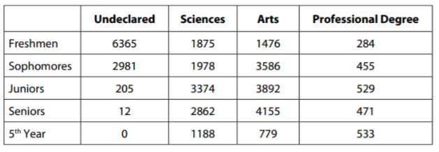
Of the freshmen who have declared a major, approximately what percent have chosen a major in the sciences?
19%
29%
59%
51%
51%
You only care about the freshmen who have declared a major. That means that you need to look at Freshmen-Sciences; Freshmen-Arts; and FreshmenProfessional. As you approach table problems on the SAT, it is important to focus on the question first and then on the table; often the table has much more information than you actually need.
Here, of the freshmen who have declared a major, 1875 are science majors, 1476 are arts majors, and 284 are majoring in a professional degree program. This should allow you to get by with an estimate: the number of “non-science majors” declared is going to be between 1700 and 1800 and the number of science majors is 1875. That should tell you that freshman science majors make up just a little more than half of all freshman declared majors, so 51% is the only answer choice that makes sense.
Example Question #4 : Drawing Conclusions From Graphs & Tables
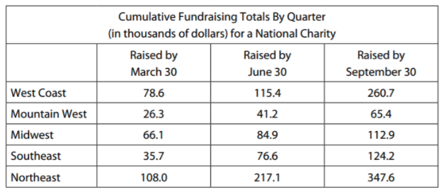
The chart above shows the cumulative fundraising totals, in thousands of dollars, for each of five regions. If the charity has a total fundraising goal of one million dollars for the year, approximately what percent of its goal had the charity achieved by September 30?
9.1%
99.1%
91%
0.91%
91%
As you’ve learned by now, you should look specifically at the question that you’re being asked before you get too concerned with the numbers in each cell. Since you’re asked about the amount raised by September 30, you’re really only concerned with the rightmost column. The sum of the cells in that column is just above 900 (you can use your calculator to add them up, or you can look at the answer choices and realize that you can get away with an estimate).
But what does that ∼900 figure represent? Twice in the problem – in the title of the table at the top and in the question stem below the table – the phrase “in thousands of dollars” appears. This means that the figure 900 actually represents approximately $900,000. So the percentage of the $1,000,000 that the charity has raised is just above 90% of the goal, making “91%” the only plausible option.
Example Question #5 : Drawing Conclusions From Graphs & Tables
The table below displays the class status and declared major for the 37,500 undergraduate students at a state university.
For which class rank (freshman/sophomore/junior/senior/5th) is the ratio of arts majors to science majors the highest?
Sophomore
Junior
Freshman
Senior
Sophomore
The two columns that matter are the arts column and the science column, and you’re looking for the highest ratio of arts to sciences. Furthermore, with five rows and only four answer choices, a quick scan should tell you that you don’t need to worry about the last “5th year” row, because it doesn’t match an answer choice. Since arts is less than science for freshmen but greater for the next three rows, you can quickly eliminate “freshman.” Additionally, since the totals are far apart (by more than a thousand) for sophomores and seniors but quite close together for juniors, you should focus your attention on the sophomores and seniors rows and can eliminate “junior” as well. Here, again, a relatively quick estimate should show you that the ratio will be bigger for sophomores than for seniors: for sophomores the difference between the two categories is higher and the number of science majors is lower, suggesting that the ratio will be much higher. Thus, our correct answer is “sophomore”.
Example Question #1 : Interpreting Graphs & Tables
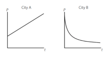
A census bureau has modeled the population change of two cities, City A and City B, and published the graphs of the models as shown above. The graphs display population (p) over time (t), and the mathematical models use the variables p (population), B (beginning population as of the initial census in the year 1900), x (annual percent change), and y (number of years). Which of the following pairs of equations best explains the relationships demonstrated in the graphs?
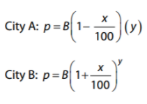
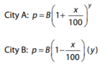
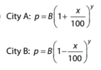
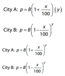
The SAT will frequently test you on your ability to recognize concepts with word problems, graphs, and equations. Here the algebra in each answer choice – and the assignment of variables in the problem – looks messy, but the SAT is essentially testing whether you can recognize what type of change is occurring within each city. From the graphs you should see that City A is increasing in population and that City B is decreasing. So you’ll want the rate of change (x) to be added for City A and to be subtracted for City B. And here is where the algebraic terms “linear” and “exponential” really come to life in graphical form: you should see that City A’s graph forms a straight line, meaning that it’s a linear increase. City B’s graph is curved, suggesting a nonlinear, exponential decrease. A linear increase means that you add the same amount each period. That means that the same amount (x% of the starting value) is added each year. For an exponential change, as with City B, the exponent shows that the change is compounded. So you need addition for City A and subtraction for City B, with a linear (times y) function for City A and an exponential function (to the y power) for City B. The only option that satisfies these conditions is:
Example Question #7 : Drawing Conclusions From Graphs & Tables
Which of the following expresses a strong positive correlation between W and T?
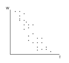
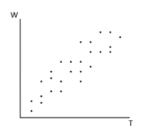
To express a positive correlation, as one component (our “x” axis) goes up, the other (our “y” axis) should also increase. In this case, both of the below options accomplish this to some extent:
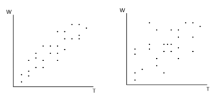
However, of these options, the first clearly carries a closer positive relationship that appears more linear and consistent in the increasing nature of both components. Thus, it is our correct answer.
Example Question #8 : Drawing Conclusions From Graphs & Tables
Which of the following would be the most appropriate label for the y-axis of this graph if the total number of farmed animals in 2002 was closest to 9 billion?
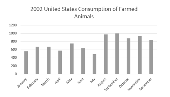
Number of animals (in thousands)
Number of animals (in billions)
Number of animals (in hundred thousands)
Number of animals (in millions)
Number of animals (in millions)
If we use some relative math to draw conclusions, we can see that adding the totals for each month gets us to around 9,000. However, the prompt tells us that the total consumption of farmed animals was 9 billion. So, we need to multiply each of our values by one million (1,000,000) to achieve this total. Thus, the y axis gives us the number of animals in millions.
Example Question #9 : Drawing Conclusions From Graphs & Tables
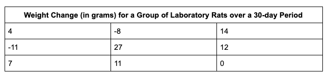
The table above gives the weight change measurements of 9 laboratory rats that were fed different diets under a variety of conditions over 30 days.
After all of the measurements were taken for the nine rats, researchers discovered that the scale used to measure the rats at the close of the experiment under weighed all of them by exactly 5 grams. Which of the following statistical values would change after 5 grams are added to each of the measurements above?
Mean
Standard deviation
Range
It cannot be determined from the information given.
Mean
In this case, if we add 5 to each of the numbers in the table above, the dispersion of the set remains the same (all values remain the same distance from one another that they started out at, and just shift 5 up on the number line). However, if I add 5 to each value, the sum of my values will increase, and thus the average/mean (the sum of numbers/number of numbers) will also increase. Thus, “mean” is our correct answer.
Example Question #10 : Drawing Conclusions From Graphs & Tables
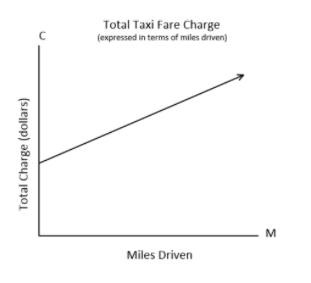
The graph above displays the charge “C” in dollars of riding a taxi for “M” miles.
According to the graph, what does the C-intercept represent?
The cost per mile driven
The cost per quarter-mile driven
The initial fee of the taxi, regardless of miles driven
The total number of miles driven
The initial fee of the taxi, regardless of miles driven
Since the “C” intercept refers to the constant in the linear equation expressed by this graph, it doesn’t make sense for the intercept to refer to a charge “per” any other unknown, whether that unknown is miles or quarter miles. We know that the intercept cannot refer to miles driven, as that has been expressed to us as “M” in this linear relationship. The “C” intercept can, however, refer to an up-front fee assessed regardless of miles driven, as is expressed in our correct answer, “The initial fee of the taxi, regardless of miles driven.”

Certified Tutor

Certified Tutor

All SAT Mathematics Resources

