High School Math : Representing Data
Study concepts, example questions & explanations for High School Math


All High School Math Resources
Example Questions
Example Question #1 : Using Box And Whisker Plots
The horizontal line in the box of the box and whisker plot represents _____________.

Median
Interquartile range
Mean
Mode
Range
Median
A box and whisker plot separates the data into quartiles so that each quartile has an equal number of data points. The box indicates the interquartile range, that is, the top line of the box is the third quartile and the bottom line of the box is the second quartile. The line separating the second and third quartiles indicates the median. The lines outside of the box indicate the outer-quartiles (first and fourth).
Example Question #271 : Ap Statistics
Based on the scatter plot below, is there a correlation between the 

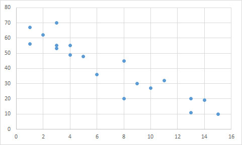
Yes; negative linear relationship
No; there is no correlation
Yes; negative exponential relationship
Yes; positive linear relationship
Yes; negative linear relationship
The data points follow an overall linear trend, as opposed to being randomly distributed. Though there are a few outliers, there is a general relationship between the two variables.
A line could accurately predict the trend of the data points, suggesting there is a linear correlation. Since the y-values decrease as the x-values increase, the correlation must be negative. We can see that a line connecting the upper-most and lower-most points would have a negative slope.
An exponential relationship would be curved, rather than straight.

Certified Tutor

Certified Tutor

All High School Math Resources

