GED Math : Representing Data
Study concepts, example questions & explanations for GED Math


All GED Math Resources
Example Questions
Example Question #11 : Representing Data
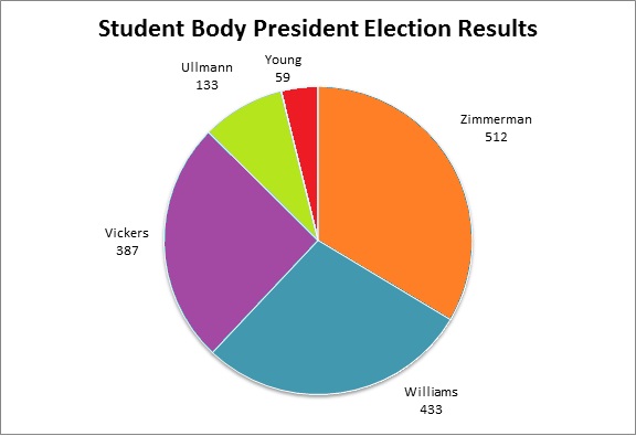
Refer to the above circle graph.
To the nearest whole percent, what percent of the students voted for the most popular candidate?


The highest vote-getter was Zimmerman, who got 512 votes; this is the part. The whole is the number of persons who voted, which is the sum:

The percent can be found by calculating:

Example Question #12 : Pie Charts
Refer to the above graph. Which of the following comes closest to the ratio of people who voted against Williams to people who voted for Williams?


The number of people who voted for candidates other than Williams is

433 people voted for Williams.
Divide 1,091 by 433:

About 2.5, or 
Example Question #11 : Pie Charts
Refer to the above graph. To the nearest whole number, what percent of the people voted against Ullman?


The whole is the number of persons who voted, which is the sum:
The part is the number of people who voted for candidates other than Ullman, which is

We now want to know what percent of 1,524 is 1,391, which can be answered by calculating:

Example Question #12 : Pie Charts
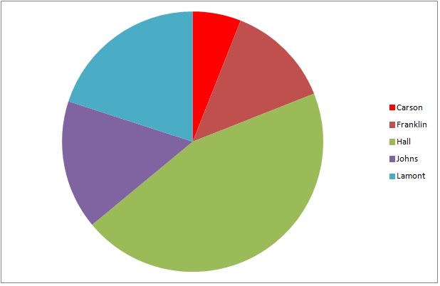
The above graph represents the results of a general election for mayor of Washington City. Hall is a Republican; Johns is a Democrat; the other three are independents.
5,328 people voted for Hall. Which is the best estimate for the number of people who voted for an independent candidate?


The green wedge, which represents Hall, is about 45% of the circle. The three wedges representing independents Carson, Franklin, and Lamont - dark red, bright red, and turquoise, respectively - together comprise about 40% of the circle. We can set up, and solve for the unknown in a proportion statement as follows:


4,700 is the best estimate.
Example Question #2061 : Ged Math
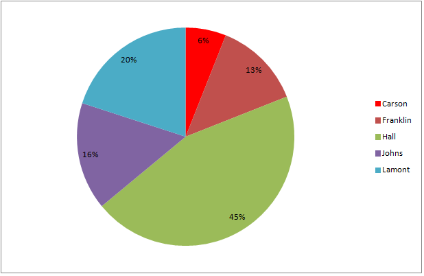
The above graph represents the results of a general election for mayor of Kingston.
If 8,488 people voted for Hall, then which comes closest to the number of people who did not vote for him?


The ratio of the percent of the voters who voted against Hall (55%) to the percent who voted for him (45%) is the same as that of the number of the voters who voted against Hall (an unknown number we will call 


Multiply both sides by 8,488 and solve:


The closest estimate is 10,400 votes.
Example Question #221 : Statistics
Use the following pie chart to answer the question:
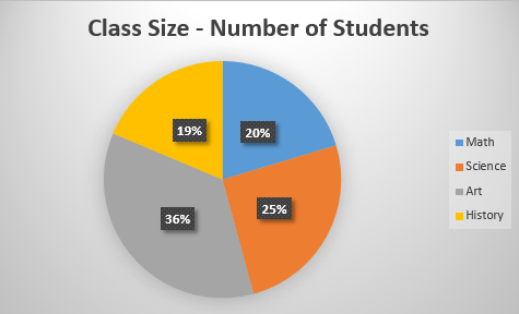
Which class has the lowest percentage of students?


Let's look at the pie chart.
We can see it represents the percentage of students in each class. The legend on the right displays which color represents which class:
blue=Math
orange=Science
gray=Art
yellow=History
So, we will look at the percentages and find the smallest/lowest number. We see it is 19% and it is the yellow class. We know yellow represents History.
Therefore, History has the lowest percentage of students.
Example Question #17 : Pie Charts
We asked 100 people what their favorite pizza topping is. Use the following pie chart to answer the question:
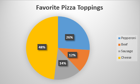
What pizza topping do people like the least?


Let's look at the pie chart:
We can see the legend on the right show which color represents which topping.
blue=Pepperoni
orange=Beef
gray=Sausage
yellow=Cheese
Now, we need to find the topping that people like the least. To do that, we will find the portion of the pie chart with the lowest percentage. We can see it is the orange portion with 12%.
Now, we know the orange portion corresponds to Beef.
Therefore, the pizza topping that people like the least is beef.
Example Question #12 : Pie Charts
Use the following pie chart to answer the question:
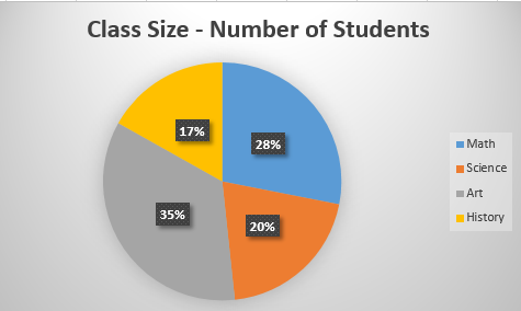
What percentage of students are in History?


Let's look at the pie chart
We can see each colored portion matches up with a class:
blue=Math
orange=Science
gray=Art
yellow=History
Now, to find the percentage of students in History, we will look at the portion that corresponds to History. We can see it is the yellow portion. We can also see it says 17%.
Therefore, the percentage of students in History class is 17%.
Example Question #221 : Statistics
Use the chart to answer the following question.
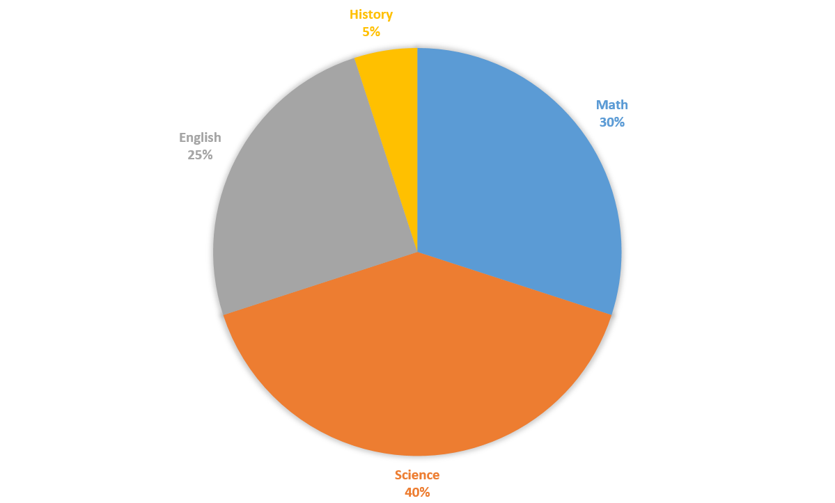
A survey found the favorite subjects of 


=42")

Example Question #12 : Representing Data
Use the chart to answer the following question.
What is the central angle formed by the sum of English and Science sectors of the chart?


The English and the Science sectors of the pie chart make up 


=234")
The central angle formed is 


All GED Math Resources

