SAT II Math II : Other Data Analyses
Study concepts, example questions & explanations for SAT II Math II


All SAT II Math II Resources
Example Questions
Example Question #1 : Other Data Analyses
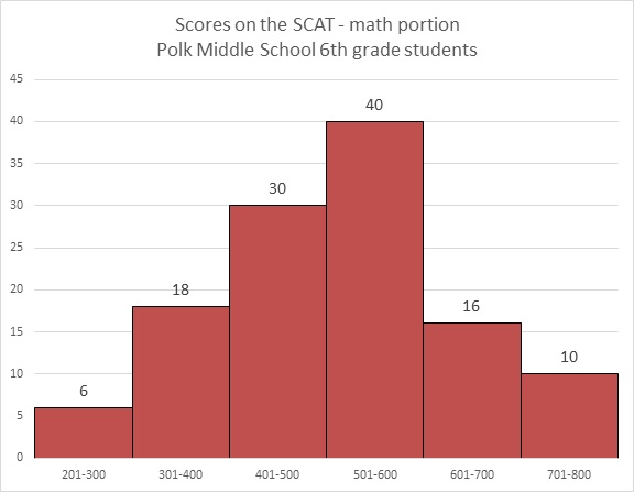
Refer to the above diagram. Maureen achieved a score of 603, which was the lowest score in the 601-700 range. Which of the following comes closest to being her percentile score?


The histogram represents a total of

Maureen's percentile is the percent of the scores that she outscored. Those scores were exactly the ones in the first four intervals shown - that is,


Percentile is given in whole numbers, so round this to 78.
Example Question #502 : Sat Subject Test In Math Ii
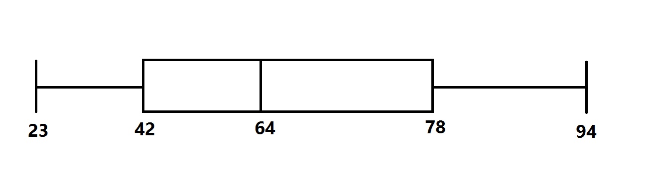
The distribution of scores for a test given to a large group of students is represented by the above box-and-whisker plot.
Which of the following questions cannot be answered from the diagram without looking for other information?
What is the range of the test scores?
What is the median of the test scores?
What is the interquartile range of the test scores?
What is the mean of the test scores?
What is the midrange of the test scores?
What is the mean of the test scores?
The midrange of the scores is the mean of the least and greatest scores, which are represented by the "whiskers" at either end:

The range of the scores is the difference of the least and greatest scores:

The median of the scores is represented by the vertical line within the box -

The interquartile range is the difference of the third and first quartiles, which are represented by the ends of the box:

Note that these scores all depend on the positions of the scores. The mean, however, depends on the scores themselves, which are not reflected in the diagram. The question cannot be answered from the box-and-whisker plot.
Example Question #2 : Other Data Analyses
Refer to the above diagram. Which of the following scores could possibly be at the eightieth percentile?


The histogram represents a total of


This score would outrank the

scores in the first four ranges graphed, but not all of the

scores in the first five ranges.
This score must fall in the fifth range shown, which is the 601-700 range.
Therefore, the correct choice of the ones given is 620.


Certified Tutor

All SAT II Math II Resources

