Statistics & Probability
Help Questions
8th Grade Math › Statistics & Probability
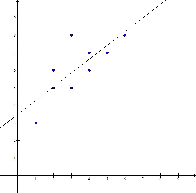
Mr. Miller conducted a statistical experiment to determine the relationship between final grades and the number of school days that his students missed. In this study, he assigned the number of missed school days as the independent variable, and the final grade was assigned as the dependent variable. Every student started the class with a 


Explanation
The equation of the best fit line will be in slope intercept form:

The question tells us that days are the independent variable, or 

Every students starts with a 


The final piece that we need is the slope, or 


If we put all of the pieces together, then the equation for the line of best fit is the following:

Mr. Miller conducted a statistical experiment to determine the relationship between final grades and the number of school days that his students missed. In this study, he assigned the number of missed school days as the independent variable, and the final grade was assigned as the dependent variable. Every student started the class with a
Explanation
The equation of the best fit line will be in slope intercept form:
The question tells us that days are the independent variable, or
Every students starts with a
The final piece that we need is the slope, or
If we put all of the pieces together, then the equation for the line of best fit is the following:
A teacher at a high school conducted a survey of seniors and found that 


Explanation
To help answer this question, we can construct a two-way table and fill in our known quantities from the question.
The columns of the table will represent the students who have a laptop or do not have a laptop and the rows will contain the students who have a car or do not have a car. The first bit of information that we were given from the question was that 


Our question asked how many students do not have a car. We add up the numbers in the "no car" row to get the total, but first we need to fill in a gap in our table, students who have a laptop, but don't have a car:
We can take the total number of students that own a lap top, 


This means that 
Now, we add up the numbers in the "no car" row to get the total:

This means that 
A teacher at a high school conducted a survey of seniors and found that
Explanation
To help answer this question, we can construct a two-way table and fill in our known quantities from the question.
The columns of the table will represent the students who have a laptop or do not have a laptop and the rows will contain the students who have a car or do not have a car. The first bit of information that we were given from the question was that
Our question asked how many students do not have a car. We add up the numbers in the "no car" row to get the total, but first we need to fill in a gap in our table, students who have a laptop, but don't have a car:
We can take the total number of students that own a lap top,
This means that
Now, we add up the numbers in the "no car" row to get the total:
This means that
Select the scatter plot that shows the most accurate line of best fit.


Explanation
A line of best fit is a line on a graph that follows the general direction of the data points displayed on the graph. The line of best fit should be as close as possible to all of the data points graphed. There should be just as many dots above the line as below the line. It displays where the two variables are correlated to one another.
Based on the options, the graph below has the line of best fit because it is close to all of the data points, follows the same direction as the points, and there are just as many data points below the line as above the line.
Select the scatter plot that shows the most accurate line of best fit.
Explanation
A line of best fit is a line on a graph that follows the general direction of the data points displayed on the graph. The line of best fit should be as close as possible to all of the data points graphed. There should be just as many dots above the line as below the line. It displays where the two variables are correlated to one another.
Based on the options, the graph below has the line of best fit because it is close to all of the data points, follows the same direction as the points, and there are just as many data points below the line as above the line.
This scatter plot represents data about snack quality (

I. The price of a higher quality snack tends to be higher.
II. Points below the line represent snacks whose price is higher than their quality.
III. Points above the line represent snacks whose quality is higher than their price.
I only
I and II
I and III
II only
Explanation
I. is a true statement about the scatter plot: as quality increases, price tends to increase.
II. is not true - the points under the line have a relatively low price compared to their quality.
III. is also not true - the points above the line have relatively low quality compared to their price.
The scatter plot provided displays a group of students' test scores versus the number of missing assignments the students have. Based on plot, select the answer choice with the data point that if added to the graph, would be an outlier.

")
")
")
")
Explanation
To answer this question correctly, we need to recall what "outlier" means. An outlier is a value that is much smaller or larger than the rest of the values in a set of data. Also, a data point that does not follow the same pattern as the rest of the set could be described as an outlier.
Let's look at our answer choices:
")
This point is showing that a student had 


")
")
This point is showing that a student who had 


")
")
This point is showing that a student who had 


")
")
This point is showing that a student who had 


")
This scatter plot represents data about snack quality (
I. The price of a higher quality snack tends to be higher.
II. Points below the line represent snacks whose price is higher than their quality.
III. Points above the line represent snacks whose quality is higher than their price.
I only
I and II
I and III
II only
Explanation
I. is a true statement about the scatter plot: as quality increases, price tends to increase.
II. is not true - the points under the line have a relatively low price compared to their quality.
III. is also not true - the points above the line have relatively low quality compared to their price.
Which of the following represents a positive association in a scatterplot?
As 

As 

As 

As 

There is no pattern amongst the data.
Explanation
A positive association is defined as a scatterplot on which the best fit line has a positive slope.
This pattern is identified because on the graph, looking from left to right, the vast majority of the points goes up.
This can also be described by saying, "as 
