Tables, Graphs, and Charts
Help Questions
DAT Quantitative Reasoning › Tables, Graphs, and Charts
Refer to the radar chart to answer the question. Which category shows the greatest difference between Clinic P and Clinic Q?
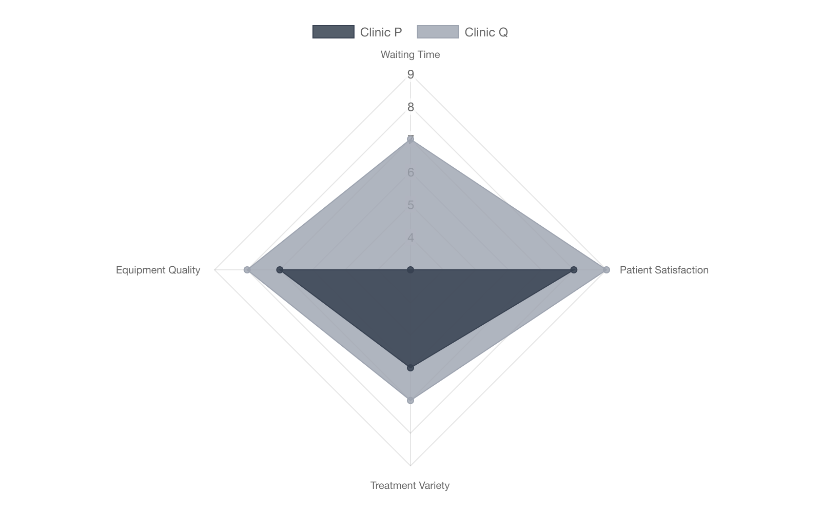
Waiting Time
Treatment Variety
Equipment Quality
Patient Satisfaction
Explanation
In the radar chart, Waiting Time spokes differ by 4 units (P = 3, Q = 7) while other spokes differ by at most 2. Therefore Waiting Time shows the greatest gap.
Use the bar chart to answer the question. What fraction of Orthodontics revenue came from the North region?
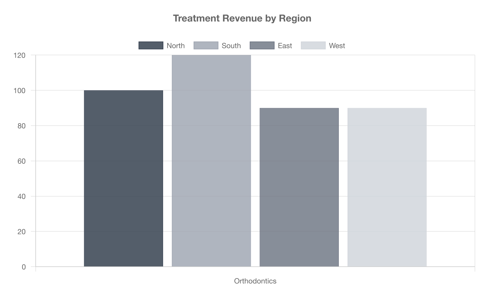
$$\dfrac{1}{4}$$
$$\dfrac{1}{2}$$
$$\dfrac{3}{8}$$
$$\dfrac{1}{3}$$
Explanation
Orthodontics bar totals $400 k: North 100 k, South 120 k, East 90 k, West 90 k. North share = 100/400 = 1/4. Other fractions use wrong component or wrong total.
Based on the trend line in the scatter plot below, which of the following best describes the correlation between age and amount spent on dental care?
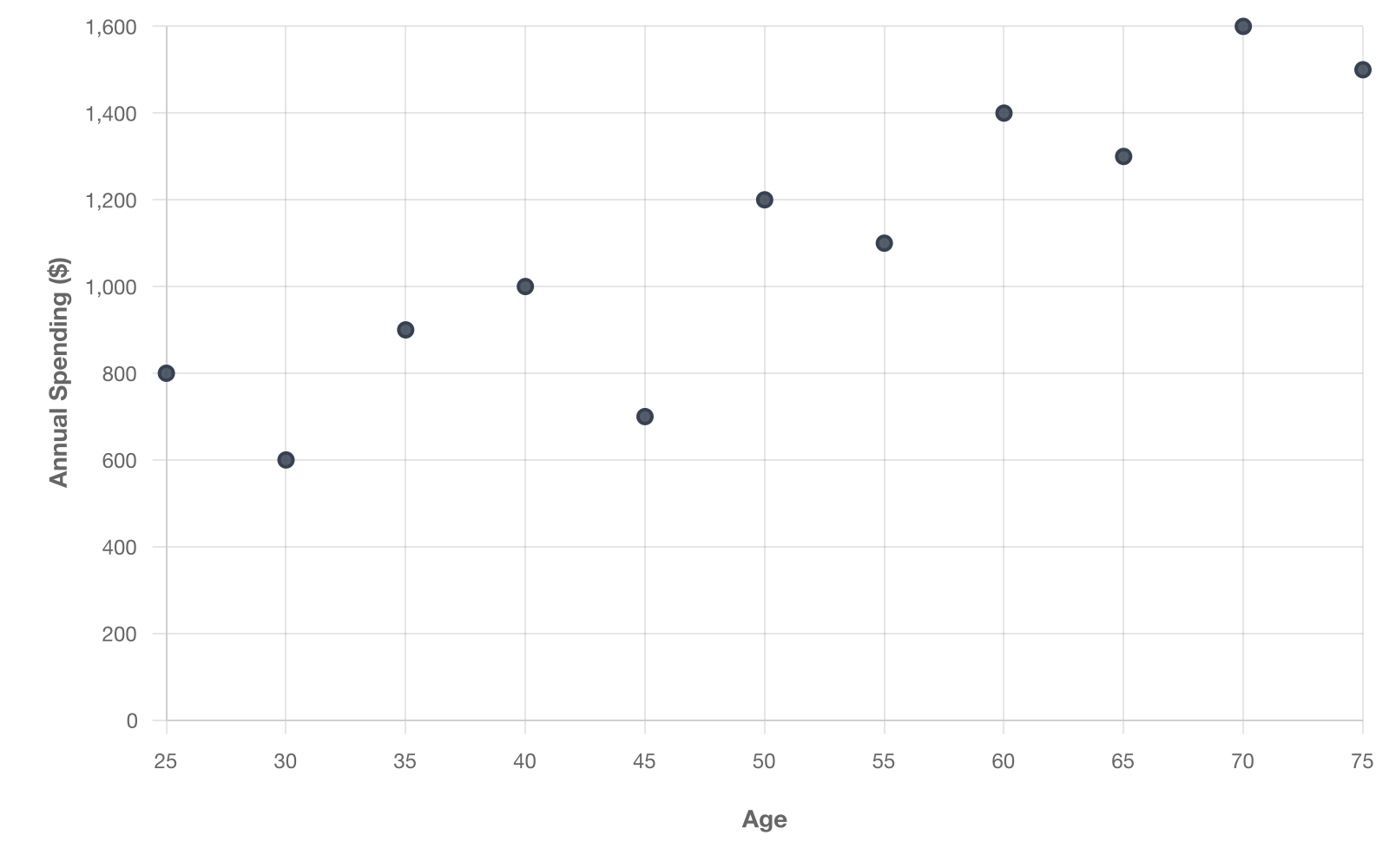
Strong negative correlation
Strong positive correlation
No correlation
Weak positive correlation
Explanation
The plotted points consistently rise with only a handful of outliers--and even those furoutliers that do not fit the overall trend increase relative to one another. This shows a strong positive correlation. No or negative correlation do not fit the upward slope.