Interpreting Data from Graphs
Help Questions
ACT Science › Interpreting Data from Graphs
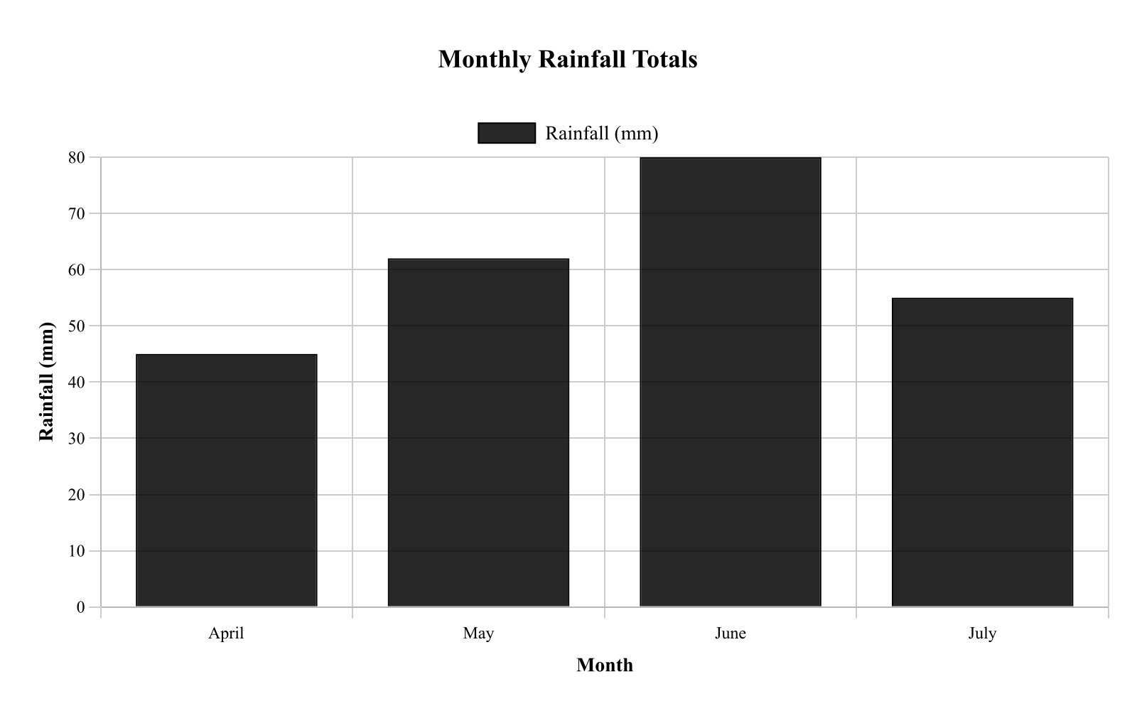
A meteorologist compared total rainfall across four months at one location. Figure 1 shows monthly rainfall totals. According to the graph, which month had rainfall closest to 60 mm?
Bar heights are approximately: April 45 mm, May 62 mm, June 80 mm, July 55 mm. Caption: Each bar represents the total rainfall measured for that month; values can be compared by bar height.
May
June
April
July
Explanation
The bar graph compares rainfall totals for April (45 mm), May (62 mm), June (80 mm), and July (55 mm). May's bar at 62 mm is closest to 60 mm, as it's only 2 mm above while others differ more. This is correct because comparing bar heights to the target value identifies the nearest, demonstrating bar graph comparison. Option C, July at 55 mm, is close but farther from 60 than May.
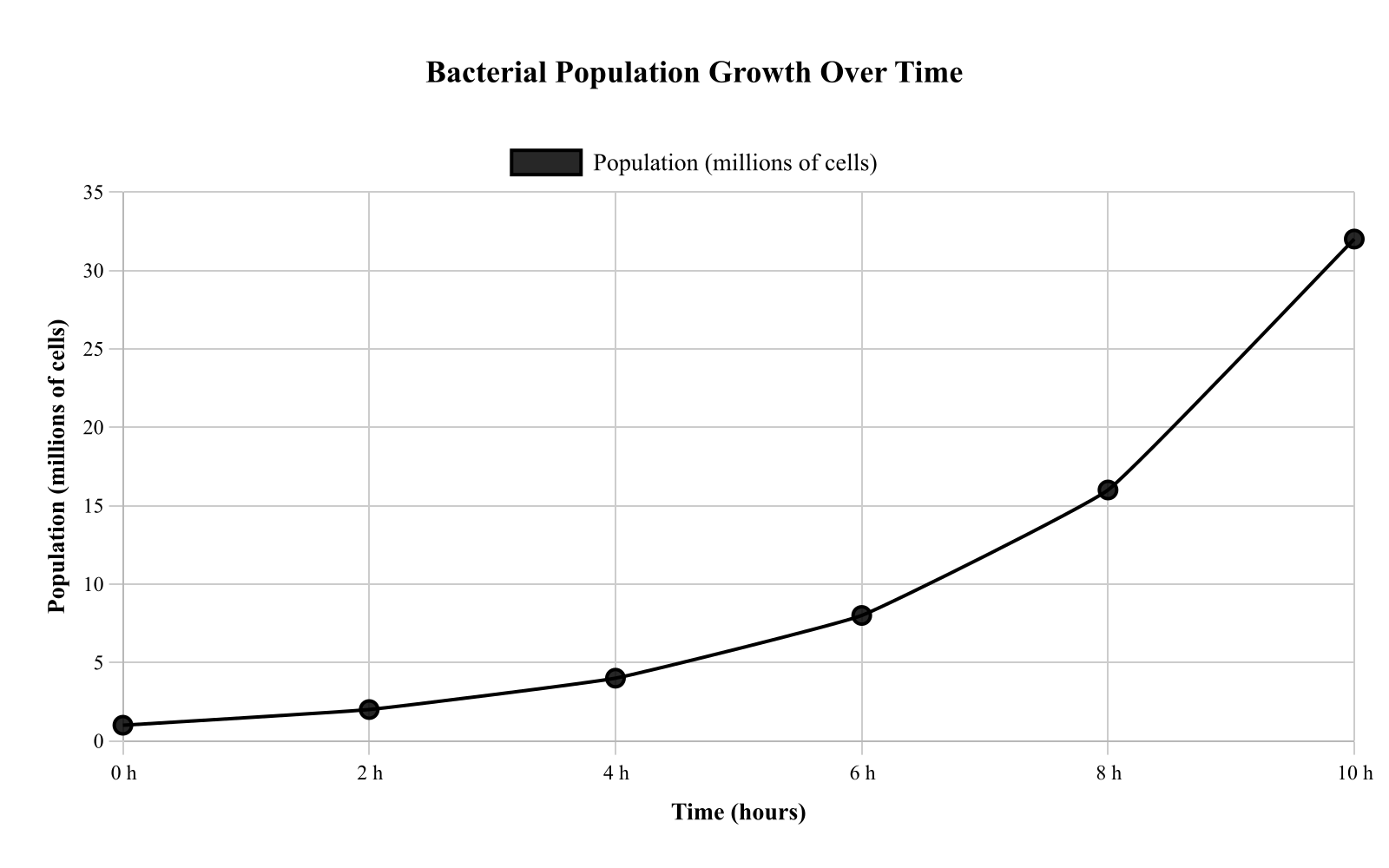
Biologists observed bacterial population growth in a nutrient broth over several hours. Figure 1 shows population size versus time. If the trend from 4 to 8 hours continues to 10 hours, what population size would be the best estimate at 10 hours?
Points are (0, 1), (2, 2), (4, 4), (6, 8), and (8, 16), connected by straight segments. Caption: The population approximately doubles every 2 hours over the interval shown; extrapolation beyond 8 hours assumes the same doubling pattern continues.
32 million cells
18 million cells
20 million cells
24 million cells
Explanation
The graph depicts bacterial population doubling every 2 hours, from 1 at 0 h, to 2 at 2 h, 4 at 4 h, 8 at 6 h, and 16 at 8 h. Extrapolating the trend to 10 h gives 32 million cells, as it doubles from 16. This is correct because continuing the pattern assumes the same growth rate, illustrating extrapolation from graphs. Option C, 24 million, might result from adding instead of multiplying.
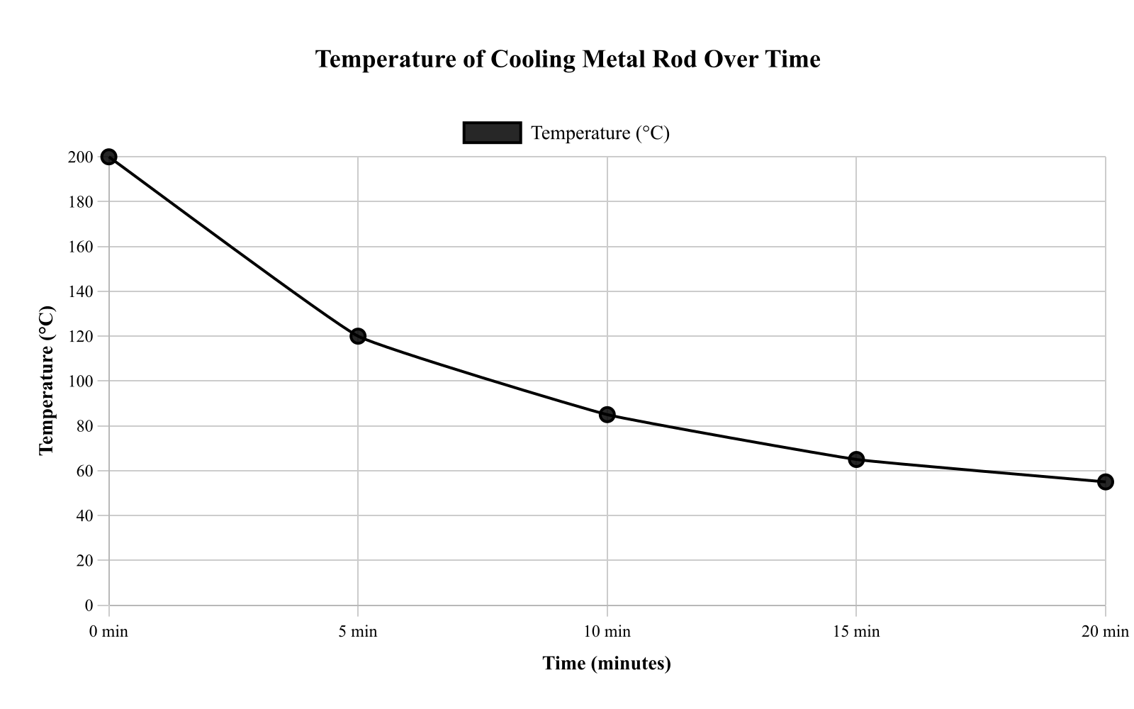
A student monitored the temperature of a cooling metal rod after it was removed from an oven and left at room conditions. Figure 1 shows the rod’s temperature versus time. Use the graph to determine the temperature at a specific time.
The curve decreases rapidly at first and then more slowly, passing through approximately (0, 200), (5, 120), (10, 85), (15, 65), and (20, 55). Caption: Temperature measurements were taken every 5 minutes as the rod cooled; points are connected to show the trend.
85 °C
65 °C
120 °C
55 °C
Explanation
The graph shows the temperature of the cooling rod decreasing over time, with the curve passing through points like (0, 200), (5, 120), (10, 85), (15, 65), and (20, 55). To find the temperature at 10 minutes, follow the x-axis to 10 min, go up to the curve, and read across to the y-axis, which gives approximately 85 °C. This is correct because the graph directly indicates 85 °C at that point, demonstrating how to read a specific value from a line graph. Option C, 65 °C, might be chosen if someone misreads the time as 15 minutes instead.
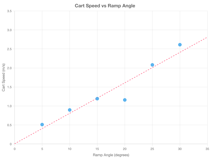
A student measured the speed of a cart rolling down different ramp angles. Figure 1 plots cart speed versus ramp angle. Based on the scatter plot, which statement best describes the relationship between ramp angle and cart speed?
Speed increases up to 15° then decreases after 15°.
Speed generally increases as ramp angle increases.
Speed generally decreases as ramp angle increases.
Speed remains constant across all ramp angles.
Explanation
The scatter plot shows cart speed increasing with ramp angle, with points clustering around (5, 0.6), (10, 1.0), (15, 1.4), (20, 1.9), (25, 2.3), and (30, 2.8). The overall trend is a steady rise, best described as speed generally increasing as ramp angle increases. This is correct because the pattern of points demonstrates a positive correlation, illustrating how to interpret trends in scatter plots. Option D might mislead if someone sees a false peak at 15° due to not viewing the full trend.
An ecologist counted the number of insects observed in 5 different habitats during a 1-hour survey. Figure 1 shows the counts.
According to Figure 1, which habitat had the fewest insects observed?
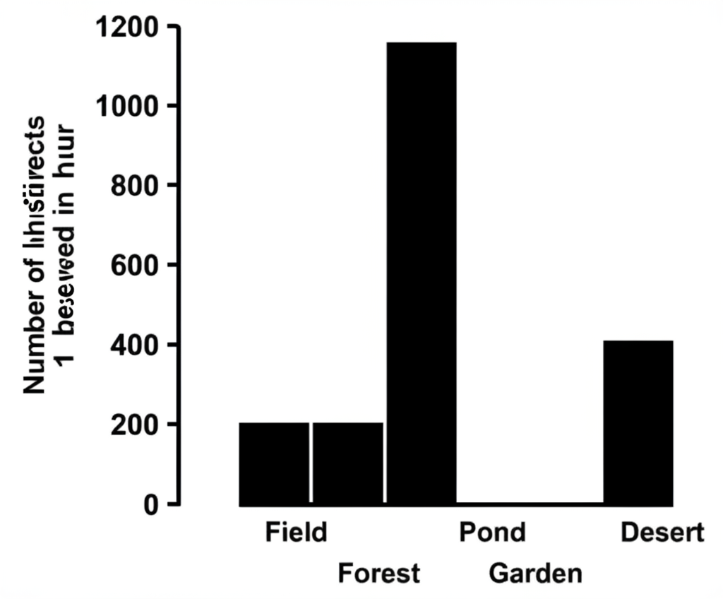
Garden
Field
Forest
Desert
Explanation
The Desert habitat had the fewest insects observed according to Figure 1. Comparing the bar heights for all five habitats (Field, Forest, Pond, Garden, Desert), the Desert bar is clearly the shortest, indicating the lowest insect count during the 1-hour survey period.
A student measured the speed of a falling object at different times after release. Figure 1 shows speed versus time.
According to Figure 1, the speed at $1.5 , \text{s}$ is closest to:
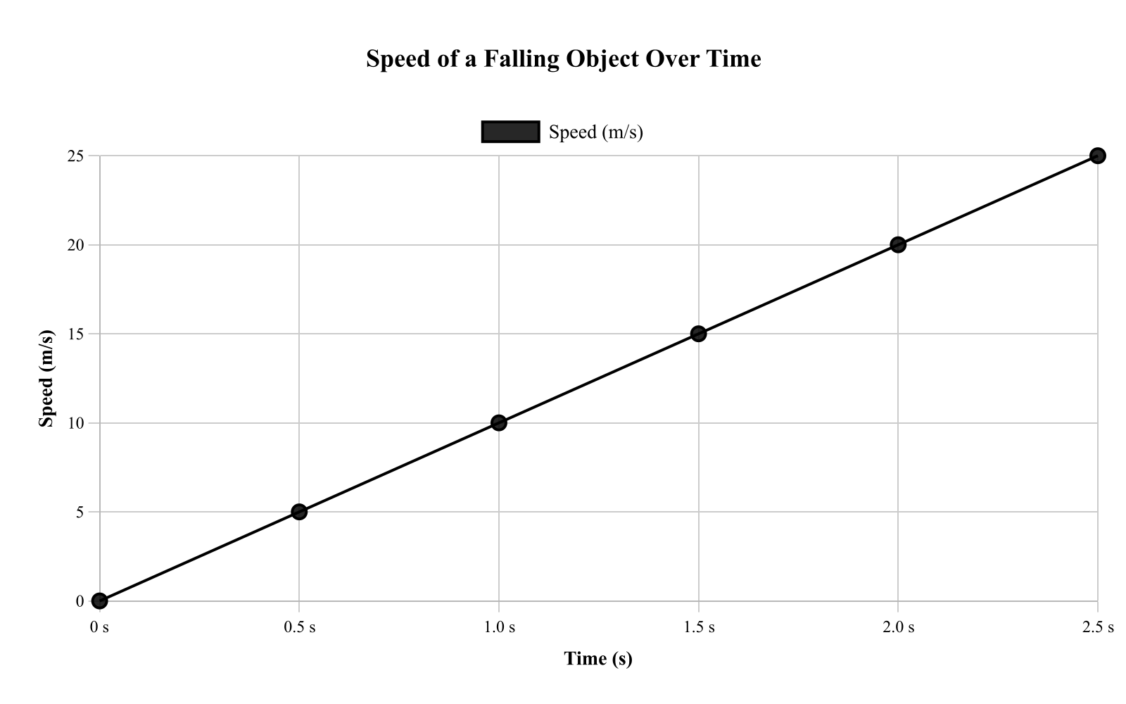
$15 , \text{m/s}$
$10 , \text{m/s}$
$5 , \text{m/s}$
$20 , \text{m/s}$
Explanation
The speed at $1.5 , \text{s}$ is closest to $15 , \text{m/s}$. To find this value in Figure 1, locate $1.5 , \text{s}$ on the x-axis, interpolate between the plotted points on the increasing trend line, then read across to the y-axis. The linear relationship shows speed increasing uniformly with time for the falling object.
An ecologist compared the average number of insects captured per trap in four habitats during the same week. Figure 1 shows the mean insects per trap for each habitat. Which habitat had the highest mean capture?
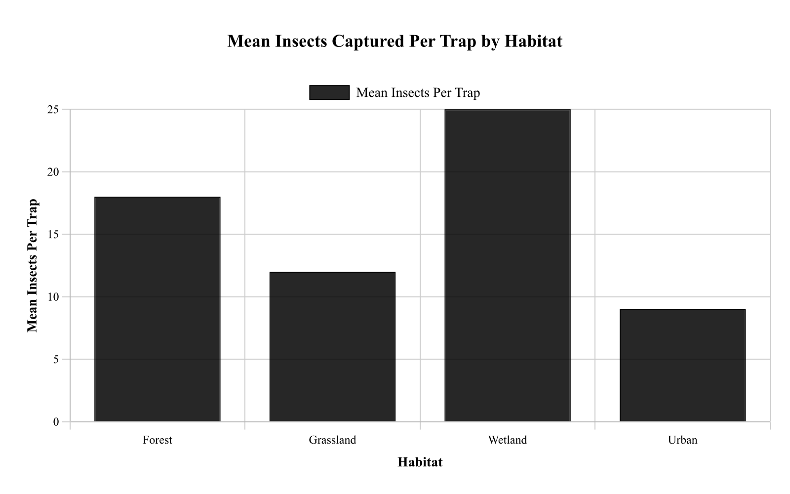
Urban
Wetland
Grassland
Forest
Explanation
The bar graph displays mean insects per trap for four habitats, with bar heights at Forest 18, Grassland 12, Wetland 25, and Urban 9. The highest bar is for Wetland at 25, indicating it had the highest mean capture. This is correct because comparing bar heights directly shows Wetland exceeds the others, teaching how to identify maxima in bar graphs. Option A, Forest, might be selected if someone confuses it with the second highest.
Based on Figure 1, as the temperature of the oils increased from 20°C to 80°C, the drop time of the steel ball:
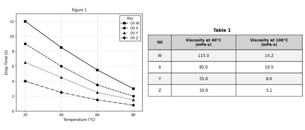
remained constant.
decreased only.
increased only.
increased, then decreased.
Explanation
The correct answer is B (decreased only). All four oil curves in Figure 1 slope consistently downward from left to right — as temperature increases from 20°C to 80°C, drop time decreases for every oil tested. This is consistent with the passage's introduction, which states that viscosity decreases as temperature increases, and since lower viscosity means the ball falls faster, drop time decreases. A (increased only) and C (increased, then decreased) are contradicted by the uniformly downward-sloping curves. D (remained constant) would require flat horizontal lines, which is not shown. On trend questions, check all curves to confirm the trend is consistent — here all four oils show the same directional pattern.
Based on Figure 1, in which of the following atmospheric layers does temperature decrease as altitude increases?
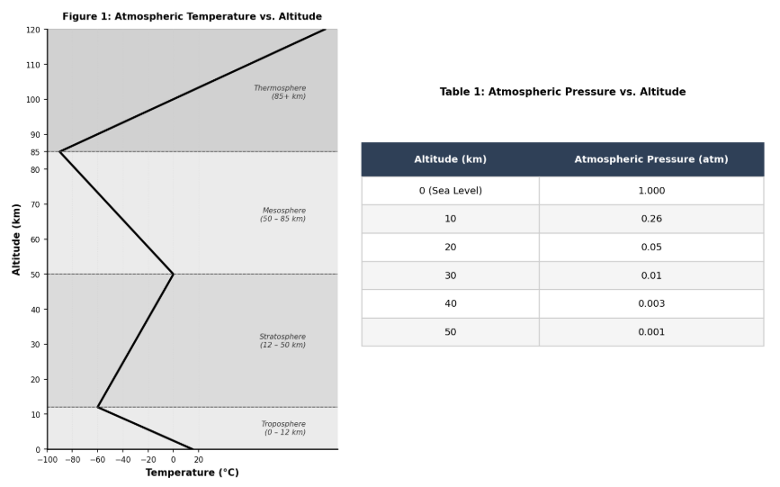
Troposphere and Stratosphere only
Mesosphere and Thermosphere only
Stratosphere and Thermosphere only
Troposphere and Mesosphere only
Explanation
The correct answer is A. Figure 1 shows temperature decreasing with altitude in two layers: the Troposphere (from 15°C at the surface down to −60°C at 12 km) and the Mesosphere (from 0°C at 50 km down to −90°C at 85 km). The Stratosphere shows increasing temperature with altitude (−60°C to 0°C), as does the Thermosphere (temperature increases rapidly above 85 km). B is wrong because both the Stratosphere and Thermosphere show temperature increasing with altitude. C is wrong because the Stratosphere shows temperature increasing, not decreasing. D is wrong because the Thermosphere shows temperature increasing. Pro tip: Read each layer's description carefully and classify it as either warming or cooling with altitude before looking at the answer choices.
According to Figure 1, the temperature at an altitude of 30 km is closest to:
0°C
−80°C
−40°C
15°C
Explanation
The correct answer is B. An altitude of 30 km falls within the Stratosphere (12–50 km), where temperature increases from −60°C at 12 km to 0°C at 50 km. At 30 km, which is roughly the midpoint of this layer, the temperature is approximately −40°C. A (−80°C) is too cold — that value is closer to the Mesopause at 85 km. C (0°C) is the temperature at the Stratopause (50 km), not at 30 km. D (15°C) is the surface temperature at sea level. Pro tip: On atmospheric layer questions, first identify which layer the altitude falls in, then use the layer's temperature range to narrow your answer.