What this quiz covers
This quiz focuses on Interpreting Data From Graphs, giving you a quick way to practice the rules, question types, and explanations that matter most for ACT Science.
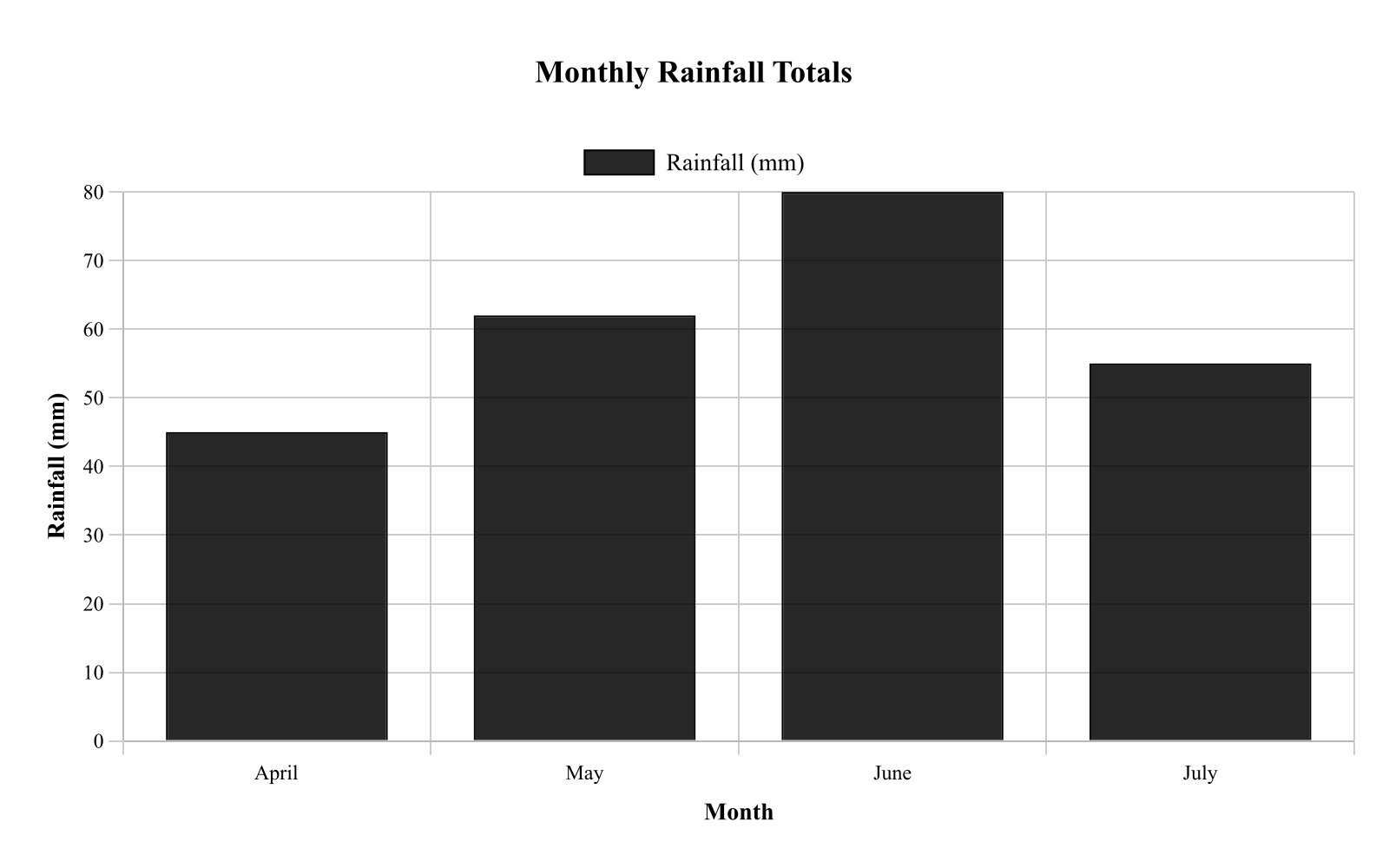
A meteorologist compared total rainfall across four months at one location. Figure 1 shows monthly rainfall totals. According to the graph, which month had rainfall closest to 60 mm?
Bar heights are approximately: April 45 mm, May 62 mm, June 80 mm, July 55 mm. Caption: Each bar represents the total rainfall measured for that month; values can be compared by bar height.
ACT Science Quiz
Practice Interpreting Data From Graphs in ACT Science with focused quiz questions that help you check what you know, review explanations, and build confidence with test-style prompts.
This quiz focuses on Interpreting Data From Graphs, giving you a quick way to practice the rules, question types, and explanations that matter most for ACT Science.
Try each quiz question before looking at the correct answer. Use the explanations to review missed ideas, then come back to similar questions until the pattern feels familiar.
A meteorologist compared total rainfall across four months at one location. Figure 1 shows monthly rainfall totals. According to the graph, which month had rainfall closest to 60 mm?
Bar heights are approximately: April 45 mm, May 62 mm, June 80 mm, July 55 mm. Caption: Each bar represents the total rainfall measured for that month; values can be compared by bar height.
Biologists observed bacterial population growth in a nutrient broth over several hours. Figure 1 shows population size versus time. If the trend from 4 to 8 hours continues to 10 hours, what population size would be the best estimate at 10 hours?
Points are (0, 1), (2, 2), (4, 4), (6, 8), and (8, 16), connected by straight segments. Caption: The population approximately doubles every 2 hours over the interval shown; extrapolation beyond 8 hours assumes the same doubling pattern continues.
A student monitored the temperature of a cooling metal rod after it was removed from an oven and left at room conditions. Figure 1 shows the rod's temperature versus time. Use the graph to determine the temperature at a specific time.
The curve decreases rapidly at first and then more slowly, passing through approximately (0, 200), (5, 120), (10, 85), (15, 65), and (20, 55). Caption: Temperature measurements were taken every 5 minutes as the rod cooled; points are connected to show the trend.
A student measured the speed of a cart rolling down different ramp angles. Figure 1 plots cart speed versus ramp angle. Based on the scatter plot, which statement best describes the relationship between ramp angle and cart speed?
An ecologist counted the number of insects observed in 5 different habitats during a 1-hour survey. Figure 1 shows the counts.
According to Figure 1, which habitat had the fewest insects observed?
A student measured the speed of a falling object at different times after release. Figure 1 shows speed versus time.
According to Figure 1, the speed at 1.5s is closest to:
An ecologist compared the average number of insects captured per trap in four habitats during the same week. Figure 1 shows the mean insects per trap for each habitat. Which habitat had the highest mean capture?
PASSAGE I
CHEMISTRY/PHYSICS: Data Representation
Introduction
Viscosity is a measure of a fluid's resistance to flow. Fluids with high viscosity flow slowly, while fluids with low viscosity flow quickly. The viscosity of a liquid typically decreases as its temperature increases. Students investigated the viscosity of four different synthetic motor oils (Oils W, X, Y, and Z) by measuring the time it took for a solid steel ball to drop through a 50-centimeter (cm) vertical glass cylinder filled with the oil.
Study 1
The students recorded the drop time, in seconds (s), for the steel ball in each of the four oils at 20∘C, 40∘C, 60∘C, and 80∘C. The results are shown in Figure 1.
Study 2
The students also looked up the established viscosity values, measured in millipascal-seconds (mPa·s), for each oil at 40∘C and 100∘C. The results are shown in Table 1.
Based on Figure 1, as the temperature of the oils increased from 20°C to 80°C, the drop time of the steel ball:
PASSAGE I
EARTH SCIENCE: Data Representation
Earth's atmosphere is divided into distinct layers based on how temperature changes with altitude. The boundary between each layer is called a pause (e.g., the tropopause separates the troposphere from the stratosphere). Figure 1 shows how average atmospheric temperature varies with altitude. Table 1 shows how average atmospheric pressure, measured in atmospheres (atm), changes with altitude.
Based on Figure 1, in which of the following atmospheric layers does temperature decrease as altitude increases?
PASSAGE I
EARTH SCIENCE: Data Representation
Earth's atmosphere is divided into distinct layers based on how temperature changes with altitude. The boundary between each layer is called a pause (e.g., the tropopause separates the troposphere from the stratosphere). Figure 1 shows how average atmospheric temperature varies with altitude. Table 1 shows how average atmospheric pressure, measured in atmospheres (atm), changes with altitude.
According to Figure 1, the temperature at an altitude of 30 km is closest to:
PASSAGE III
EARTH SCIENCE / BIOLOGY: Conflicting Viewpoints
Introduction
Approximately 66 million years ago, a mass extinction event occurred at the boundary between the Cretaceous and Paleogene periods (the K-Pg boundary), wiping out roughly 75% of all plant and animal species on Earth, including all non-avian dinosaurs. Geologists have discovered a distinct layer of sedimentary rock worldwide at the K-Pg boundary that contains unusually high levels of iridium, a metal rare in Earth's crust. Two scientists present different hypotheses for the cause of the extinction and the source of the iridium.
Scientist 1
The mass extinction was caused by the impact of a massive asteroid, approximately 10 kilometers in diameter. Asteroids are naturally rich in iridium. When the asteroid struck the Earth, the immense force of the collision vaporized the asteroid and a large portion of Earth's crust, ejecting a massive cloud of iridium-rich dust and debris into the atmosphere. This dust cloud enveloped the planet for months or even years, blocking out incoming sunlight. The lack of sunlight halted photosynthesis globally, causing the collapse of marine and terrestrial food webs.
Furthermore, the impact would have triggered global wildfires, acid rain, and massive tsunamis. The presence of shocked quartz (quartz crystals deformed by intense, sudden pressure) and tektites (glassy spheres formed by rapidly cooling, ejected rock) in the K-Pg boundary layer alongside the iridium firmly points to a high-velocity extraterrestrial impact as the sole trigger of the extinction.
Scientist 2
The mass extinction was not caused by a sudden impact, but rather by intense, prolonged volcanic activity. Around 66 million years ago, a massive volcanic region in what is now India, known as the Deccan Traps, experienced a series of colossal eruptions that lasted for tens of thousands of years. These eruptions released millions of cubic kilometers of lava.
While iridium is rare in Earth's surface crust, it is present in high concentrations in the deep mantle. The massive magma plumes from the Deccan Traps brought this deep-Earth iridium to the surface, where volcanic ash plumes spread it globally. The prolonged eruptions released massive quantities of sulfur dioxide (SO2) and carbon dioxide (CO2) into the atmosphere. The SO2 caused severe short-term global cooling and acid rain, while the CO2 led to long-term extreme global warming. This resulting climate instability severely stressed ecosystems over thousands of years, leading to a gradual, rather than instantaneous, mass extinction. Shocked quartz can also be formed by the explosive pressures of massive volcanic eruptions.
According to Scientist 2, the high levels of iridium found in the K-Pg boundary layer originated from:
PASSAGE V
ASTRONOMY / EARTH SCIENCE: Data Representation
Introduction
Astronomers classify stars based on their surface temperature and their luminosity. Surface temperature is measured in Kelvin (K). Luminosity is a measure of a star's total energy output compared to the Sun (L⊙). For example, a star with a luminosity of 102L⊙ emits 100 times more energy than the Sun. The Hertzsprung-Russell (H-R) diagram shown in Figure 1 maps stars according to these two properties.
Study
Astronomers measured the properties of four specific stars, labeled A–D, located in different regions of the H-R diagram. Results are shown in Table 1.
An astronomer discovers a new star with a luminosity exactly 100 times greater than the Sun's and a surface temperature of 10,000 K. According to Figure 1, this star is most likely a:
A sample of water was removed from a freezer and heated at a constant rate until it had completely turned to steam. Its temperature was recorded throughout. Figure 1 shows the results, divided into five segments. A sample's temperature stays constant while it changes from one state to another.
Based on Figure 1, during which segment does the sample melt?
Atmospheric Structure
Earth's atmosphere is divided into four primary layers based on the way temperature changes with altitude. From lowest to highest, these layers are the troposphere, stratosphere, mesosphere, and thermosphere. The boundaries between these layers are known as "pauses" (e.g., the tropopause).
Researchers launched a series of weather balloons and sounding rockets to record the atmospheric pressure (in millibars, mb) and temperature (in °C) at various altitudes. The average data for a mid-latitude region is presented in Figure 1.
The relationship between atmospheric pressure and altitude is shown in Figure 2.
A weather balloon carrying instruments requires an atmospheric pressure of at least 10 mb to function properly. Based on Figure 2, what is the approximate maximum altitude the balloon can reach before its instruments fail?
A lab group tracked the concentration of dissolved oxygen (DO) in a stream across one day. Figure 1 shows DO concentration versus time. At what time is DO at its minimum value?
The curve decreases from about 9.0 at 0 h to 7.2 at 6 h, reaches a lowest point near 6.5 at 10 h, then rises to about 10.0 at 18 h and ends near 9.2 at 24 h. Caption: DO was measured periodically; the minimum corresponds to the lowest point on the plotted curve.
A student tracked the mass of a wet towel as it dried at room temperature. Figure 1 shows towel mass versus time.
According to Figure 1, the towel's mass at 15 min is closest to:
A physics student rolled a cart down a ramp and measured its speed at different distances from the start. Figure 1 shows speed versus distance.
According to Figure 1, the cart's speed increases the most (largest change in m/s) over which distance interval?
A student measured the density of different materials. Figure 1 shows the measured densities.
According to Figure 1, which material has the greatest density?
A student recorded the temperature of cooling coffee after it was poured into a mug. Figure 1 shows temperature versus time.
According to Figure 1, the coffee temperature at 12 min is closest to:
A student measured how the boiling point of water changes with altitude. Figure 1 shows boiling point versus altitude.
Based on Figure 1, the boiling point at 1,500 m altitude is closest to: